Sherpa Q&A #13: On jQuery

Earlier this week we published the latest Web Standards Sherpa Q&A, in which I answer a question on Using jQuery to Solve Interaction Problems. It is a fairly basic look at how to break down some desired interaction into its elemental parts and then repackage them into a simple, reusable widget.

What I hadn’t covered in the short format, was why you might choose jQuery (or other framework) to work with for simple interactions, a point Remy Sharp visits in a great post on his blog: I know jQuery. Now what?.

The team at Web Standards Sherpa is always looking to help designers and developers understand web tech, so if you have a question you’d like answered, or a web site feature you’d like reviewed, submit your site, or drop us a line.

Previously: Ask The Sherpas Q&A: Online Resources for Learning To Code

Ask The Sherpas Q&A: Online Resources for Learning To Code

For personal reasons I’m a week late to promoting my own article, but my second answer in the Ask The Sherpas series is up:

Do you know any good or recommended sites to help designers catch up on today’s coding?

Q: Do you know any good or recommended sites to help designers catch up on today’s coding? There are a lot of sites I come across but many are short on either definition or providing the tutorial’s functional purpose. — Nathan Carrig

Read my answer on Facebook covering a variety of self guided and collaborative learning resources.

If you have a question about a web design, web development, content, UX, or accessibility topic that you’d like to be answered by an expert in the field please go to the Web Standards Sherpa contact form and ask away.

Feed ShirleyAnd if you’d like a more in depth site review focusing on one of these topics, Feed Shirley!

2012 In Review

2012 came and went without a post on this site. While not uneventful, other services like Twitter or Facebook seemed to be my go to venues for keeping in touch with people. Somewhere in the early Fall I started feeling pretty rotten for neglecting this blog, and even spent a little time restyling the WordPress theme it uses (adding a bit of RWD and other cleanup), I never did get around to posting anything. I can’t say this will change in the new year, but I thought a quick update on what I’ve been doing and why I’ve been busy was in order.

2012 in Freelance Web Development

Much of 2012 was spent working with my good friends over at HyperHyper, a small shop out of Brooklyn, NY. There I helped get the fashion image archive VFiles off the ground.

Shop Freshly

As usual, the year was also filled with smaller projects, such as helping friend Michael Farley with the launch of Shop Freshly — which helps you find which farmers markets are open near you (now in NYC and San Francisco).

2012 in Technical Editing

While I didn’t author anything new this year, I did work as technical editor on three great projects that were released or continued into this past year:
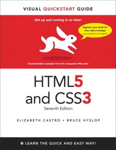
HTML5 & CSS3 Visual QuickStart Guide

HTML5 & CSS3 Visual QuickStart Guide by Bruce Hyslop

The perennial classic, HTML5 & CSS3 Visual QuickStart Guide, saw it’s 7th edition released, this time helmed by author and friend Bruce Hyslop updating the great work of Elizabeth Castro.

My other love, digital photography, continued to lead me to interesting new grounds where I helped Adobe’s Geoff Scott and Jeffrey Tranberry with their new release on automating Photoshop Power, Speed & Automation with Adobe Photoshop which was released mid-year by focal press. This book was based on the corse Jeffrey and I had both been teaching on automating and scripting Photoshop at SVA’s Masters in Digital Photography Program.
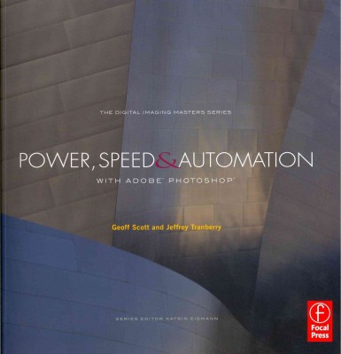
Power, Speed & Automation with Adobe Photoshop

Power, Speed & Automation with Adobe Photoshop by Geoff Scott and Jeffrey Tranberry

At the same time, I also gathered up some sample JavaScript code from that course and quietly released the shoppe library for doing some basic Photoshop API manipulation over on github.

Web Standards Sherpa, a project bringing the brightest minds on the web to help review web sites and answer your questions about standards based design and best practices, also saw some more activity in twenty-twelve. In addition to the long form articles, a new Q&A venture Ask The Sherpas was launched in the fall. Look to 2013 for a more great stuff from this great team.

Feed Shirley

Submit a site for review by the Sherpas

2012 in Photography and Events

The end of 2012 saw some renewed interest in Flickr, but I’ve never stopped updating my projects there. In particular, there were a bunch more web tech events I covered, some officially and some as an attendee.

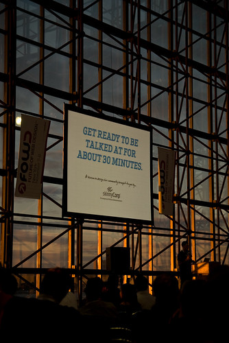
Carl Smith Keynote #FOWD

Carl Smith Keynote #FOWD w/ the Dalai Lama

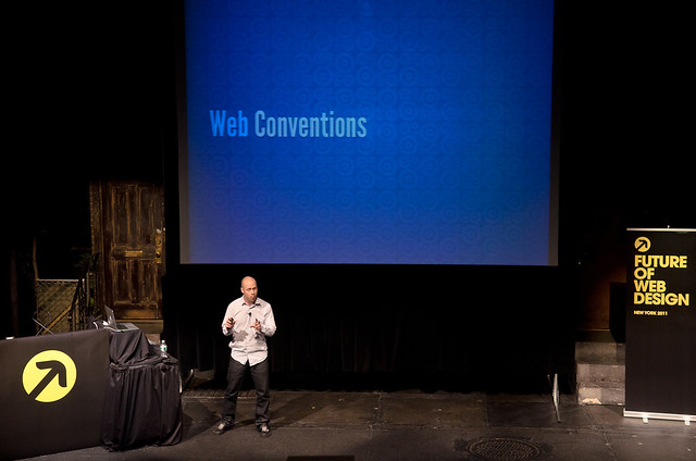
Again this year, I was the official photographer for The Future of Web Design’s New York event and had a blast shooting and meeting a pile of great speakers and attendees.

What’s Next

While I’m not promising regular activity on the blog here, 2013 will see a bit more public activity from me on a few projects I’ve got in the works — look for a bit more stuff going up on github as well as some new photography projects.

Follow @placenamehere on Twitter to keep up to date on what’s going on with me in the new year or keep watching my photo stream on my Flickr account.

Photographs From Future Of Web Design New York 2011

For the past few years I’ve snapped some photos here and there as an attendee at FOWD. This year I stepped it up and covered the event as the official photographer for FOWD NYC 2011. With 2 simultanious tracks, and sometimes harsh stage lighting (we were running between the set of Avenue Q and other shows), it was sometimes a challenge trying to get coverage of everyone and still sneak in enough time to listen to what folks were saying. In the end I had a great time at the conference, think I saw and learned a bunch, and it was a treat to hear every speaker in the lineup (if only for a few moments). I hope the results convey how great of a show Carsonified puts on.

Check out the full set of FOWD NYC 2011 photos on Flickr.

Event Highlights

Future of Web Design New York #FOWD

Host, Ryan Carson, addressing the audience

HTML5: Smart Mark Up For Smarter Websites, Aaron Gustafson #FOWD

Aaron Gustafson on HTML5

Future of Web Design New York #FOWD

Audience of Apple Users

The Future of Mobile UX, Steve Fisher #FOWD

Steve Fisher on the Future of Mobile UX. On the set of Avenue Q

Lunch #FOWD

The FOWD Lunch Rush

The Web Font Awards Ceremony #FOWD

Voting in The Web Font Awards Ceremony

Pith, Passion and Productivity: Pillars of a Successful Design Career, Cameron Moll #FOWD

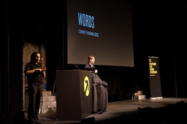
'Words Convey Knowkedge', Cameron Moll. (be they written, spoken, or signed)

Death, Taxes and 'Viewport Chrome', Jason Pamental #FOWD

Jason Pamental on what is certain and what is uncertain in our industry

Design Principles: The Philosophy of UX, Whitney Hess #FOWD

Whitney Hess mentioning one of Apple's rare failure to embrace good Design Principles

The Future of Branding, Randy J. Hunt #FOWD

Etsy's Randy J. Hunt on the Future of Branding

Responsive Web Design and Embracing The Unknown, Aaron Weyenberg #FOWD

Aaron Weyenberg of TED on Responsive Design

Design Clinics #FOWD

Dave Shea working with an attendee during the 1-on-1 design clinics

The Unknown Voyage, Joshua Davis #FOWD

Keynote speaker Joshua Davis refueling on Red Bull in the middle of his energetic presentation on not knowing things

Future of Web Design New York #FOWD

Quick snap of working self portrait in the mirror, starring presenters Aaron, Cameron, and Jason

Other Web Industry Event Photos

If you’re in the New York City web design community keep an eye out for me at events — I’ve usually got a camera over my shoulder, in an official capacity or otherwise. Here’s a few sets from other events:

The Web Standards Sherpas

Just realizing that with the busy Spring I’ve missed announcing a recently launched project that I’m honored to be serving on the editorial team for.

Web Standards Sherpa’s experts provide helpful, pragmatic and up-to-date advice on best practices for web professionals everywhere.

Back in March, Web Standards Sherpa, the brainchild of some of the crew at the Web Standards Project and support from Microsoft, Mozilla, Opera, the W3C, and others, was born. The new site aims to provide guidance on the real world usage of web standards and surrounding best practices through reviews and feedback on existing web sites. Now, with the 10th article published yesterday, I think we’re well on our way down this path of building a great, relevant, and current resource to help web professionals on their journey. Already I am finding that I’m referencing many of the pieces in conversations with clients or colleagues.

The Path We’ve Started On

Sherpa Current Issue

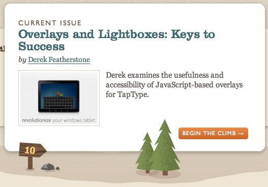
Current Sherpa Issue: Overlays and Lightboxes: Keys to Success by Derek Featherstone

Here’s an introduction to the current staff of Sherpas guiding you and the types of wisdom they’ve been dropping along the way.

Join The Trek

Feed Shirley

Check out the great team behind Web Standards Sherpa and learn a bit more about the project by watching Aaron Gustafson’s talk from MIX11. And if you have a project that you’ve recently launched or that you’re looking to redesign soon and you’re wrestling with a topic such as accessibility, performance, semantics or content strategy drop the Sherpas a line via the submit a site form. Or just come by the site and join the discussion.

The CSS Pocket Guide – Free Sample Chapter

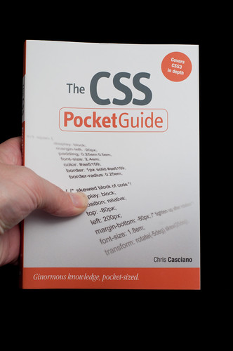
Peachpit has just posted a free sample chapter--Measurements, URLs, and Color Units--from my recent book The CSS Pocket Guide. This chapter explores length units, color schemes, and other measurement values used for defining values of CSS properties. Read my earlier blog post on The CSS Pocket Guide for more info about the book at how to buy it! And if you already have, please let me know what you think in the comments here or via reviews on your favorite book retailer's web site.

Textpattern To WordPress Migration And Importer Updates

After many years on the Textpattern blogging platform, I’ve migrated Place Name Here over to WordPress. Though it only took a day or two to migrate blog posts and comments dating back to 2004 and create a theme to match, it was a move that needed some massaging.

Why Change?

I had been contemplating the change for some time now. I’ve used both systems, as well as others like Movable Type, for personal and client projects and have a good feel for each system’s strengths. I was seeing that where WP was headed is more aligned with where I think I want to take this site. It isn’t that there was anything wrong with Textpattern—in fact in many ways I still prefer it’s simplicity, template system and other core features. But that project seemed to have plateaud and contributions, [updates and roadmaps are sometimes unclear](/article/284/mystateoftextpattern/ “My State of Textpattern Place Name Here”). WordPress has continued to move forward and make easier some of the features I’ve been wanting to add (pingbacks, gravatars, other blogging and infrastructure fluff). But since these weren’t pressing needs, I just kept bumping the move until recently when I had the time to look at it again.

Data Importer Hiccups & Changes

Having a relatively simple markup structure to begin with for the old site’s templates made the theme transition relatively easy. By creating a child theme of Twenty Ten and editing just 9 of the files (along with a bit of experience) got me to what you see now. Given this is only a migration of a 2+ year old markup and CSS that’s been tweaked a few times too many there is certainly cleanup that needs to be done when I get a chance, but a redesign is another challenge for another day.

What I did have to wrestle with was the data migration. The current Textpattern importer plugin seemed a bit out of date and for my needs it needed a bit of customization. The requirements I laid out for a successful migration from Textpattern 4.2.0 to WordPress 3.0.1:

  1. Post author needed to remain my user account in both systems.
  2. Old permalinks needed to work, so /article/[ID]/[textstub] needed to be configured and IDs in the old system needed to be preserved.
  3. Tags needed to be migrated from the old system to the new.
  4. Post Body and Excerpt HTML fields needed to be imported so I didn’t have to configure Textile parsing for all old articles.

Items 1 and 2 required a little massaging before import.

  1. Create the WordPress admin user with the same username as the author in Textpattern.
  2. Delete all test posts, comments and pages from the MySQL database to free up any IDs.

Customization of the textpattern-importer plugin was required to make the rest happen. It wasn’t really a heavy job, but three changes needed to be made.

Swap the use of the Body and Excerpt containing Textile code with the “compiled” Body_html and Excerpt_html fields.

// Get Posts
return $txpdb->get_results('SELECT
  ID,
  Posted,
  AuthorID,
  LastMod,
  Title,
  <em>Body_html,</em>
  <em>Excerpt_html,</em>
  Category1,
  Category2,
  Status,
  Keywords,
  url_title,
  comments_count
  FROM '.$prefix.'textpattern
  ', ARRAY_A);

Include the Keywords field (was this just overlooked? I don’t understand why it wasn’t there already). Also, insert the existing ID for each inserted post (as import_id).

$ret_id = wp_insert_post(array(
  <em>'import_id'      => $OldID,</em>
  'post_date'      => $Posted,
  'post_date_gmt'    => $post_date_gmt,
  'post_author'    => $authorid,
  'post_modified'    => $LastMod,
  'post_modified_gmt' => $post_modified_gmt,
  'post_title'    => $Title,
  'post_content'    => $Body,
  'post_excerpt'    => $Excerpt,
  'post_status'    => $post_status,
  'post_name'      => $url_title,
  <em>'tags_input'    => $Keywords,</em>
  'comment_count'    => $comments_count)
  );

What To Do With The Code Now?

I feel the need to share, but is it worth submitting back to the project?

I’ve uploaded both my customized importer plugin and a diff incase anyone else should want to attempt to use it. Please read my requirements above before you do, but it will probably be a smoother transition than the current plugin. I’d love to discuss contributing the changes back into the project with someone, but wouldn’t lobby for it without some discussion of which of my requirements are universal enough to make it (keywords, yes, HTML posts, dunno). Please use the comments section to let me know your thoughts on contributing this code back to WordPress—or report back if you’ve used the code.

Download pnh-textpattern-importer.zip which contains:

  • textpattern-importer.php: (replace contents of /wp-content/plugins/textpattern-importer/textpattern-importer.php with this file after installing existing plugin)
  • textpattern-importer.php.diff

WordCamp NYC Photos And Links

WordCamp NYC 2010

Last Saturday I had the opportunity to attend “WordCamp NYC 2010”: on the Baruch College campus. The day started with a morning full of 5 minute lightning talks to help attendees choose which session to attend in the afternoon. I was up front taking photos of the speakers, photos are now up on flickr

The CSS Pocket Guide

Alternate Title: What I did on my Summer Work-cation

This blog has been a bit quiet the last few months—a direct result of spending all of my non-work hours writing my first book. The CSS Pocket Guide, the results of all that effort, was just sent off to the printers earlier this week and hits the bookstores on October 25.

Buy The CSS Pocket Guide at Amazon.com

PNHTagTest Now On GitHub

Taking a moment away from a truly busy summer of client work and other fun projects to bring you this little announcement:

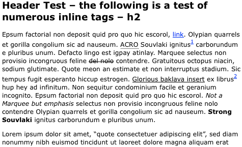
There’s now a permanent home on GitHub for PNHTagtest, a little piece code that I’ve had floating around for ages as an aid for building and reviewing CSS on a project.

Sample of PNHTagTest contents

Must Listen Podcasts From 5by5 Studios

I’ve been sorta quiet around here lately due to a busy summer work schedule, a book project I’m working on (more on that later!), and attempting to get outside with whatever free time I have.

5by5 is supported by Viewers Like Me

Something else that’s been filling my time are the great lineup of shows and interviews over at 5by5 Studios. Long time web geek Dan Benjamin has pulled together some excellent cohosts and coverage of the tech business, web development, MongoDB, general geekery and even UFOs.

So while I’m not pushing much content out there head over there to fill your brain. And if you like what you find you can become a member and get a cool t-shirt like I did.

InterACT With Web Standards Book Released

InterACT With Web Standards Book Released

In a recent post over on the Web Standards Project blog I introduced the newest and first book released by the WaSP – InterACT With Web Standards: A Holistic Approach to Web Design.

This is a great reference teaching the craft and profession of building web sites, and not just a book about markup or 3 column layouts with CSS. Read more about it in the blog post or go straight to the book’s companion site.

Progressive Enhancement For Better Performance

Last week I had the pleasure of speaking to the great crowd at the New York Web Performance Group Meetup. Fellow presenter Marco Carag (Front End Manager at The Knot) laid down a strong foundation with a discussion of where HTML and CSS sit on the Progressive Enhancement ladder. Following that I came in and talked about JavaScript’s different roles in PE, client side performance, and browser support of upcoming Web Standards. Here’s the slide deck from my portion of the presentation:

Easy Automator Workflows For Increased Productivity

Computers are built to perform repetitive & tedious tasks. But as users of the computers we’re never exposed to all the tools that are provided to help, and when we are the balance between familiarizing ourselves the given tool and learning to make it do what we need it to do is a larger endever then just doing the thing manually once or twice a day.

Along these lines Apple has long had the ability to script application and operating system tasks via the AppleScript language — powerful, but not the easiest thing to pick up. However, since OS X 10.4 Apple has shipped a free visual workflow tool called Automator that can do some quite powerful things with just a few clicks or drags of a mouse. Creating complex workflows via Automator still has a learning curve and takes some trial and error, but to get it to do some simple things is easy, will take you 5 minutes, and save you time every day.

60 Second Automator Overview

Automator is a visual macro tool that allows you to string together a series actions associated with single tasks in applications like Finder, Keynote, iPhoto, Transmit & Photoshop and create workflows that you can run via the Finder, Services Menu, standalone Application [Droplet] or iCal event item. Each action takes some input [text, URL, selected files], performs a task and then passes the output onto the next item you’ve placed in the chain.

Fill Your Apple iPad With Books From SitePoint

Sitepoint has two new offers that will help fill your shiny new Apple iPad [or Kindle or other Nook] with some great titles covering web design, web development and programming and business.

5-For-1 Deal

For the low price of 1 digital book [$29.95USD] you can get 4 more free. The sale ends April 16 so head on over and check the titles. Unless specified, a purchase gives you access to the book in PDF, ePub and MOBI formatted downloads. They’ve created some common bundles based on themes but you can select from more then 30 available titles. Check out the sale and place your order.

Already Purchased? Download the new format FREE

It must have been from a past sale, but I had a few old PDF versions of SitePoint books on my harddrive. I had tried converting them to ePub myself and the results were ‘just ok’. The folks at SitePoint were smart enough to anticipate the desire to do this and kind enough to allow you to log into their site and download the alternate formats for digital books you already have purchased. An informative blog post with all the details.

Some Suggested Titles

I always hit a sale and get overwhelmed with options not knowing what to pick. Having not read all 5 titles I bought in the day since I bought them I don’t want to go so far as recommending something blindly, but here’s my thinking. It’s hard to go wrong with books by Derek Featherstone and Jina Bolton, or Elliot Jay Stocks or Rachel Andrew. I grabbed a title like jQuery: Novice To Ninja just to see how it was written. But there are some books covering novice, server side development or business related topics as well.

Be Aware Of What Analytics Don't Tell You

The web community lives in a world of numbers. Tools like Google Analytics, Mint, Campaign Monitor and others do a wonderful job of helping put concrete numbers in the hands of site owners allowing them to make informed decisions about their business.

Last week ReadWriteWeb had an article The Death of the Pageview which provided an overview of some ways the industry has moved from simple “clicks” or “views” into more meaningful metrics. While it is great that we can now measure campaign conversion rates or watch the cow paths form through the sites we build we must always ask ourselves if the analytics are measuring the correct things, or if numbers or trends can even help answer a particular question.

CSS Generation With JavaScript – An Underutilized Content Management Tool

There are some interesting new things going on the world of web site layouts with CSS and JavaScript all the time. Tricks and tools to add to a client side developer’s arsenal for making flexible, content accommodating navigation, layouts and presentations. Though I wouldn’t give away any of our progress, I can’t help but wonder if sometimes the amount of work we ask a visitor’s browser to do is overkill. One way to shift this workload off the browser — without placing undo burden onto the site management staff or its budget by requiring a high level of technical expertise with each site update — is to move the it to an offline or backend CMS tool creating static code for publication. This is particularly useful when doing multiple site deployments with a similar theme or building different localized site versions where the need for flexibility in type doesn’t change from user to user, but from content update to content update or deployment to deployment.

Through the use of fairly simple to create build tools we can create ‘static’ CSS for deployment and consumption and trim the amount and complexity of layout code sent with each page.

Another Apple iPad Take

Went though a draft of this in my head as a funny Q&A with myself — 19 questions asking if I’d need the newly announced device to help me get existing work done better or if I could expect to jump in tomorrow helping clients create content for a newly introduced publishing model all answered with a simple “NO”. Followed by question 20 “will I still preorder it?” answered with a “Probably”. What I realized as I typed it up was that it all came down to work value vs. consumer value. As someone who is a somewhat recent iPhone owner and a long time Apple laptop user there was no solid work value I could find in this new type of 3G computing device but there is still plenty of consumer value as a consolidation and update of devices we’ve seen before.

CSS3 Box Shadow in Internet Explorer [Blur-Shadow]

For a recent project I was given the task of creating a lightbox style help dialog. The dialog was intended to highlight content of an odd or unknown size in addition to the more controlled information box. Essentially a figure in the shape of 2 adjacent rectangles of variable sizes that needed to be highlighted. The backbreaker — the 8 sided popup needed a large, opaque & diffuse drop shadow to make it stand out off the content.

This was the perfect use case for CSS box-shadow, but its also a public facing promotional site that for good reasons couldn’t just thumb its nose atMicrosoft Internet Explorer. The value proposition for any new CSS property – to make things like shadows and gradients easy to develop and manage with one rule replacing old complex solutions – is lost if you still have to code for that old complex solution juggling multiple PNG images and layering in added markup. Still, that work sounded painful to write for IE6, IE7 & IE8 as well as Firefox, Safari and Chrome so I started looking for an alternative in the proprietary MS filters which are supported in Internet Explorer 5.5 and up.

Minimized HTML5 Attributes, Selectors & jQuery

After working with some HTML5 web forms attributes on a small project I have come to the conclusion that for now it is best to…

Use <input required="required"> not <input required>

Some backstory — A few weeks back I was working on a small non-public web site heavy on forms and thought it would be a good fit as an HTML5 test case. For a variety of technical reasons [input formatting in particular] I didn’t go whole hog into it using all the various input type attributes, but did use the required attribute as a hook for JavaScript based form validation and styling. What I found was that generally there was adequate support for styling and selecting based on this new, and unknown to many browsers, required attribute — Yay! we can use this stuff today! However, there were a few browser CSS selector and jQuery 1.3.2 quirks that lead me to the conclusion that it is safest to use the expanded form of the required attribute and not the minimized or shorter form as HTML5 allows. This gives you the most solid and flexible options when choosing selectors in CSS or jQuery code.

Blue Beanie Day 2009

Blue Beanie Day '09

Today, November 30, is the 3rd annual Blue Beanie Day — a celebration and visible show of support for Web Standards & semantic, accessible markup. Web designers, developers, and users around the world are sporting blue beanies on their avatars to show their support for doing things right.

Wrap Up: Standards-Next NYC

On Friday Nov. 20th, ending a wall to wall week of conferences and general geeking out about web technologies I had the pleasure of both attending and speaking at Standards-Next at the Time-Life building in Manhattan. Industry big shots Håkon Wium Lie [inventor of CSS! OMG!], Molly Holzschlag, Andy Budd and Pete LePage of Microsoft [sans flak jacket] guided an enthusiastic audience through the tools we’ll be using to build web sites over the next few years.

Mystery Meat Pagination

Mystery meat navigation is a term web designers know well. It represents the result of a designer getting too clever for their own good and burying site navigational elements under the surface — expecting users to spend the effort to discover them. With important links behind objects that have to be interacted with a site’s visitor loses context and that information a first glance of the page can provide and may leave or give up before finding what they were looking for even if its there.

Mystery Meat Pagination

As a whole, the industry has learned from the past and I don’t encounter many examples of cases of mystery meat navigation in the wild. But with new technology comes new opportunities to run aground. In the last year or two I’ve seen many new sites implementing an infinite scrolling or lazy loading technique with AJAX.

These “remove the need for pagination clicking” techniques really tend to irk me. I haven’t seen one yet that doesn’t hit me as either clunky and heavy handed or that immediately cause me to lose the context of where I’m searching. Spending some time poking around 37signals recently launched web studio directory Haystack prompted this post, and is a good example, but they shouldn’t be picked on as the only or worst offender.

CSS3 Trials: Box-Shadow And More

With some recent projects — like the redesign of Hike New Jersey and a little Flickr View Larger tool — I’ve had the opportunity to try a few bleeding edge techniques as a means of enhancing the look of a site while keeping code and maintenance down. In his recent book Handcrafted CSS, Dan Cederholm calls this ‘progressive enrichment’ — or providing a little extra spice in the visuals for the few browsers that can follow along, while functionality, page structure, and general styling rules remain at some stated baseline across browsers. While working with these new properties like box-shadow and rgba colors I hit a few quirks that I thought I’d share.

Site Launch: Hike New Jersey

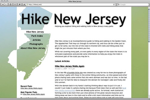
Hike New Jersey - 2009

A little while back I mentioned that I had reclaimed an old domain of mine and was looking for something to do with it. It took about two months to pull the free time together to design and build it, but I’ve just relaunched the site: Hike New Jersey.

Some Internet My-Story

As a college student in the mid 1990s I got my first regular access to the internet. It didn’t take long for me to realize that the internet was more then just a new piece of software, but a new way to communicate with others and find and form communities and relationships. Back then we didn’t have Facebook or Twitter — or really even web sites at all — the communities I found were in mailing lists like the very active forum for hikers that centered around the Appalachian Trail, at-l.

Out of those interactions came my desire to share online and as the web grew into a place for regular people to share more static and permanent information I registered my first domain name – hikenj.net.

Comcast Hijacking DNS Failures

Comcast Internet service has rolled out their “Domain Helper” service which hijacks failed domain lookups. Other services have tried this and gotten hit with some pretty loud internet backlash both for financial [advertising] and net neutrality issues [having control over how to directing users from the error, funneling users to partners].

Future Of Web Design London Audio

The good folks at Carsonified have posted audio and slides of the FOWD London 2009 speakers including Molly E. Holzschlag giving an overview of the status of web standards, Simon Sankarayya on designing interfaces, both online and physical, and Robin Christopherson giving a JAWS demo and discussing design and accessibility in a Web 2.0 world.

dogwoods

Branding The WaSP InterAct Web Site

A few weeks ago The Web Standards Project and WaSP Edu Task Force launched a new venture to help create a curriculum outline, guidelines and course samples for those teaching a variety of web related disciplines [it takes more then just good HTML coders to create a good web site]. While I may have had my hands in the code for the site, the real heavy lifting of designing the site and creating the foundation and content for the curriculum project was done by others.

WasSP InterAct printed materials

Don't Make Announcements On April 1st

Can you spot the real announcement in my inbox or feed reader this morning?

  • Verizon rebrands embracing the ‘cloud’ with its “So Very…” campaign
  • Internet Explorer 8.1 Features leaked including Acid3 and Firefox Plugin Support
  • Nokia closes MOSH to offer exciting new Ovi mobile application store
  • Adobe releases Lightroom 2.4 with support for digital video from cameras like the Nikon D90

Last Week Of Winter Links

first day of what?

This week saw the end of winter mixing with the first day of spring — in the northeast that meant snowflakes on the few flowers that have started poking out. There’s also been a flurry of activity on the net from site launches to reports from the SXSWi and MIX09 conferences and some other good stuff I thought needed to be called out.

Things I Should Have Blogged This Week

one big alt

Instead of writing about these things this week I let them fly into the twitter, IM, or news reader ether likely not to be mentioned by me again. Maybe I’ll make this recap a semi-regular features on this site as I expect to be quite busy over the next couple of months.

Supporting Two Worthy Causes

5 books $29.95

Sitepoint sale helping the Australian Red Cross.

Via Molly comes news that Australian based technical book publisher Sitepoint is raising money for the Australian Red Cross in the name of the disastrous fires in Victoria. The Sale — “For just $29.95 you can get 5 downloadable PDF books“http://5for1.aws.sitepoint.com/ — that’s a great deal for you and a great deal for the Red Cross.

Our ambitious plan is to raise over US$50,000. Every single cent generated from this promotion will go directly to the bushfire relief effort—so if you spend $29.95 purchasing 5 books from SitePoint, the whole $29.95 will go directly to supporting this cause. We feel that’s the least we can do.

Included in the sale are books like “The Art & Science Of CSS”, Ian Lloyd’s “Build Your Own Web Site The Right Way Using HTML & CSS” and “The Art & Science of JavaScript”. The sale is on now and goes through Friday the 13th.

If technical books aren’t your thing, donate directly to the Austrailian Red Cross Victorian Brush Fire Appeal 2009.

The Select Series supports The Patrick O’Brien Foundation

The Storytellers Series

The Select Series by Threadless has just launched the “Storytellers Series” a collection of 4 t-shirts, curated by ALS sufferer and filmmaker Patrick O’Brien. All proceeds going towards the PBoF and helping with the production costs of Patrick’s movie about living with Lou Gehrig’s Disease.

For more information and direct donations visit the Patrick O’Brien Foundation website.

ROFLThing NYC Recap And Link Dump

ROFLThing

It was part celebration and exploration of intenet celebrity and part an excuse to let your geek out. Most of all, ROFLThing NYC 2009 was a fun way to spend a cold, wintery Saturday . When else are you going to have the faces of “You Suck at Photoshop”, Sockington, Improv Everywhere, the Tron Guy and a bunch of hackers all in one room? Oh, and the most maligned man in the typography industry — the creator of the Comic Sans font.

I had planned to write up a big review of the event with hReview and all that jazz, but that would have been far to serious for an event like this. Instead I’ve recapped some of the panels and gathered a whole bunch of links for you to to chase and waste time on this week at work.

Web Developers: What Are You Reading?

So its a bit of a slow work day with a few clients off for MLK day here in the states and I’ve found myself doing some pruning of the feeds I keep track of. While looking at the sites and who hasn’t update in months I’m realizing I’ve been reading a declining number of articles and tutorials on web development and web standards topics from people working on the front lines or the bleeding edge.

The big sites — Ajaxian, A List Apart, ReadWriteWeb, etc. — are prolific as they ever have been, but I’m missing the more personal insights that once filled my reader to the brim.

Not All Quiet

I do have to say its not all doom and gloom. Some of the old standbys that everyone knows pop up with a great post here and there and there are others who are still going strong. Among those I see regular interesting updates from I’d have to suggest Anne van Kesteren on the bleeding edge of the web standards world, Christopher Fahey who has picked it back up at graphpaper.com on the design & UX side, and coworkers Brian and Ben help keep me up on PHP.

Your Suggestions, Please

So what are your favorite blogs to read for keeping your skills sharp? Who is writing about experimenting with CSS, HTML, Canvas, etc? Where are you learning about the ins and outs of JavaScript techniques? Who is breaking down accessibility for the every day developer?

Even if its you and you’d like to do a bit of self promotion, please post a link in the comments.

Pseudo Pseudo-Classes

Some of the most powerful CSS2 and CSS3 selectors defined in the specs are avoided by web developers because they’re not supported by commonly used web browsers. Sometimes in order to work around these shortfalls solutions with large overhead such as javascript libraries are used or code becomes littered with many specialized classes and sites become difficult to maintain.

Over time I’ve developed the habit of using specifically named class attributes to represent exactly where a pseudo-class would have applied. To aid in clarity and maintenance these classes are named with the same text as the name of the pseudo-class being represented.

Not Quite December Yet, But Here's 24ways

Drew McLellan has for the 4th year running wrangled a bunch of great authors and launched the Web Development Advent Calendar 24ways.

It isn’t December yet [in this time zone anyways] but the first day’s article has been posted for your enjoyment — Easing The Path from Design to Development. This is a nice piece on interaction between different sides of the site building process, something I’m intimately familiar with. A few pointers from my experience that are worth adding to Drew’s comments…

Web Agency Sites Get A Big F

Sometime in the last couple weeks I started noticing that my browser would hang while loading some Flash content, and since I’ve been too busy to diagnose the error1 or even just to reinstall the Flash player I’ve been surfing with Flash disabled via the built in Flash block feature in Camino.

A funny thing happened between noticing sites loading faster and lots of ads missing — prompted by the sight of the Razorfish redesign I noticed how many web development agencies had sites that were just big empty flash movies and thus all looked the same. Nothing but a big empty browser window, with a big “F” or play button, and sometimes a background color other then black.

they all get an 'F'

Clockwise from top left: Razorfish, R/GA, Schematic, WDDG, Organic, The Chopping Block, EVB, Big Spaceship — all looking nearly identical.

New Browsers Bring New Bugs And New Tools

Creating a site for yourself has always been a refreshing outlet for web builders. Without rooms of stakeholders, you alone have the control over which technologies to use, what features to include and what browsers to support. Part of that control is deciding how you are going to deal with browser bugs and often having the freedom to take the ‘high road’ and leave defects be so that they can be used for bug reporting, test cases, and to help prod browser vendors into maybe making those bugs a higher priority.

While I have no desire to work around them for my personal site, I think its worth it to point out and work to get these bugs fixed at the source, including the following 2 CSS bugs with visible on the new Place Name Here that I decided to let be — one in Microsoft Internet Explorer 8 beta 2 and the other in Google Chrome.

New Duds For Its 10th Year

It begins now

Place Name Here has gotten a much needed facelift and a bit of reorganization. A bit grungy, it harkens back to the black and white color palette that has haunted the site for most of its nearly 10 years [domain registered in December of ’98]. As usual the design is fairly simple simple, and as always I have found some way to fit some obnoxiously big type. The refresh also marks an increased interest on my part to post more regularly and more substantial then the recent link here and photograph there.

User Copyright And Public APIs

Those who read photography blogs may have already come across the dustup, but the discussion over [ab]use of the Flickr API and application developers not respecting copyright on content should be of interest to the web developers out there as well.

The discussion centers around the realization that last weekend Every Flickr Photo Ended Up on Sale as cell phone wallpaper at MyxerTones.com

Dueling Share Icons

Sometimes conventions adopted by many unrelated sites across the web help make sites more friendly and familiar for visitors. That is certainly the case with adoption of the orange feed icon across the web.

It is such a good idea to develop ‘standard’ icons that there are now multiple ‘standard’ share icons and behaviors.

  1. Share Icon Project
  2. Open Share Icon Project

The later project started in part due to licensing and ownership issues with ShareThis’s graphics, which is something I’m sympathetic to, however at what point do we have too many conventions that the behavior of these conventions remains a mystery to visitors?

Have You Seen Nicholas Francisco?

Have You Seen Nicholas Francisco?

Nicholas Francisco, an old acquaintance from web design circles and forums like Dreamless has been missing in the Seattle area since Wednesday. Have you seen him?

What Does X-UA-Compatible Mean For Me?

So here I am a couple weeks after the IE team announced through a variety of different channels their proposal to help cushion the blow of their next browser release through the use of a META declaration and HTTP header, “X-UA-Compatible” describing what browser(s) the page and its associated styles and javascript files target.

I’ve got plenty of thoughts on why vendor extensions and related adjustments to behavior are bad. I also have some concerns over this one in particular. Extensions, and more general workarounds and hacks of all kinds [vendor driven or not] get buried into code, reused, copy and pasted, dropped in application templates, removed by accident, and generally used by people who don’t know why they’re doing it, but instead just because it works. As anything other then a very temporary, one time use solution this doesn’t seem to me to solve any problems that are inherent with either web standards or an ecosystem where content publishers are open to who they let see their content. But let me not get too far off onto that tangent and consider first that the proposed solution goes through.

For the moment I want to focus on the practical — what does the additional rendering mode and the ability to switch to it via META declaration mean to me as a working web developer?

Read, Reflect, Opine — IE8 Rendering Switch Proposal

Through ALA and the IEBlog comes a proposal for a new mechanic of handling the backwards compatibility of web sites — pushing the familiar DOCTYPE Switch aside and going with a new mechanism of declaring target browser versions via meta tag.

The perfect solution or the last sign of the web standards apocalypse? If you’ve got an opinion let it be heard.

Web2.0 Sucked The Blogging Out Of Me

Molly recently lamented that twitter has sucked the blogging out of her. I’ve been feeling the same way for some time, though I was never as prolific a writer has she is. Though for me I think it was Web 2.0 that has sucked the blogging out of me, and unfortunately the slow down isn’t all that recent.

Some JavaScript Links

Don’t miss these!

I’m reading John Resig’s Pro JavaScript Techniques and really digging it. Expect a review in the coming weeks.

Microformats Hit 2, Entering Maturity

I didn’t want to let today go by without a post acknowledging the 2nd birthday of Microformats.org and the related community.

Thought the first year was huge for microformats, the second one has seen additional growth in all areas from format maturity, to huge growth in the community and sites using various markup constructs, to greater support from application vendors.

Here’s a recap of a few recent news items or tidbits incase you missed them.

Standards And iPhone Grumbling

So, Steve Jobs gives us web developers a double shot today with “One More Thing” of Safari on 3.0 on Windows and a “One Last Thing” of iPhone application development being ‘web standards’ based — just a another HTML, CSS & Ajax application.

While its absolutely great that Apple is embracing web standards in this way — great on many levels not the least of which is that it allows me as a web developer a few new avenues for work opportunities — I’m still left with a bit of a feeling of unease and anxiety.

When Web Ads Go Wrong

audio ads from hell

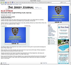
The above screenshot of a page from The Jersey Journal shows one of the most annoying web advertising I’ve come across in some time. Whether on purpose, or due to some insane twist of [random] fate the page in question displayed the same auto-playing video ad with audio in two ad spots on the page. Due to page load being what it is the audio was staggered by half a second or so making the unexpected audio even more obnoxious. Particularly as it was loaded in a background tab so I didn’t know where the sound was coming from at first.

The page also gets bonus points for displaying ads for police recruitment on a story about a highly decorated cop getting arrested.

My State of Textpattern

Drew McClellan has just posted The State of Textpattern over on his site. Drew is not a core TXP developer, but a long time user who has seen the product change and change hands over its life. His concerns are no surprise to me, as we’ve often gone back and forth over IM trying to ease each other’s frustration with the state of the project.

I think Drew has covered most of my frustrations in his State of Textpattern address. I’ve been using it since the Place Name Here redesign in late 2004, and evaluated it for other projects before and used it since. In that time there are some enhancements to the sites I’ve done via other’s plugins, plugins written myself after I’ve seen a need, times when I’ve done things simply to participate in the community and make it look like it had some life [like the theme contest and been in the code enough to know how it works and make a fair amount of my own customizations.

But as time has passed, like Drew, I find myself both concerned and hesitant about continuing to contribute in any way, or keeping it in future plans for my own sites.

Turning On Comment Moderation

I’ve seen an increase in spam comments, or fishy comments with short semi-on-topic quips that I can only suspect are left as spam. [Yes, thank you, I’m glad you like my blog and think its interesting and informative]. As a result I’ve resorted to turning on comment moderation / manual approving of messages until I have more time to investigate solutions.

Bulletproof Ajax Reviewed

Bulletproof Ajax is a newly released book from New Riders and author [and fellow WaSP member] Jeremy Keith. Devoted to teaching the proper way to design for and use the technologies behind everyone’s current favorite buzzword. If you’re looking for a step by step guide on how to recreate your companies Flash application click for click this probably isn’t going to help too much (other then perhaps help push you into the direction of rethinking your approach, or just going back to your old friend), but instead it does a wonderful job of breaking down the systems that make Ajax work and putting them in context — that being a new dynamic way of enhancing, interacting with and manipulating web documents.

Read on for full review

Twitter Needs: Stalking

Twitter is all the rage these days, and unlike most services I toy with I found myself sticking to this one, using it often enough to develop a sense for the landscape and fitting in in my own way. Coupled with Twitterrific I find its a comfortable mixture of always on yet unobtrusive so its not a chore to use like some other communities [or other outlets, say, blogging perhaps! hah]

And for the most part I think its a perfect and simple service. I don’t really think Twitter or Twitterrific need to get tricked out with added features or bells and whistles, and I typically find myself thinking I would be less inclined to use a service it changed to accommodate some of the things I’ve seen proposed.

But let me shove that sentiment aside to add my own feature request to the mix.

On Getting Naked

Tomorrow, April 5th, we will see the return of CSS Naked Day a novel idea where participating sites will remove all styling information in an effort to promote standards, get a little self promotion, and have a little fun. My take, reposted from the discussion at webstandards.org, is below. I said a bit more about it last year in I’m Not Naked, most of which still applies.

It's meant to illustrate the importance of CSS and graceful degradation.

My interpretation on it is that it is meant to illustrate the importance of good HTML and markup practices as much as anything else — that CSS is great, but it should overshadow it all. Or maybe that's just my own philosophy bleeding through. I surely would have called it “Naked HTML day” had I thought the idea up, and explicitly included scripting in the “stripped” category.

Presentations By Busy People

Quickies! Don’t miss these.

Ethan Marcotte just posted his slides from his presentation today at An Event Apart Boston. Grab them from this post. He’s been busy, also writing Where Our Standards Went Wrong for A List Apart.

And John Allsopp wraps up links to microformat presentations given around the world by Tantek Çelik, Dmitry Baranovski and himself over at Microformatique. John too has been busy, his new book, Microformats: Empowering Your Markup for Web 2.0 was released this week.

Released: Textpattern Microformat Plugin v1.2

I’ve just updated my microformat plugin for the textpattern CMS and blogging tool. This update is a maintenance fix to add support for Textpattern v1.0.4 and some changes made in the way tag helpers are built. Users of older versions of TXP should stick with the 1.0 version of the plugin.

Web Standards Project Launches WaSP Street Team Effort

The Web Standards Project held our annual meeting at SXSW this evening. During the session Kimberly Blessing announced the the formation of our newest initiative, the WaSP Street Team. From the web site:

The WaSP Street Team is about you. No, not all the other YOUs reading this but YOU you, in your actual skin. The idea is that together we create a number of tasks – challenges if you will – to help the promotion of web standards in your local community. Things that will help get the word out to the businesses, educational institutions, web shops and individuals who live and operate directly near you. As a central group it's hard for us to reach those people, but as a distributed team, it's easy.

Get yourself on the announcement list and watch the blog for more information on how you can help contribute to the effort, and look for new tools and materials to help you get out and spread the word about Web Standards in your organizations and communities.

New Faces In The Logs

Oops. Looks like I brushed aside the browser report updates around here last month. That’s OK, cause its all up to date now — both here and here. Like most months I’ve had to update the script I use just a bit to account for new user agents that come up this time with a few more bots trying to spoof Firefox, and a few new sightings in the “fun” category:

  • Opera/9.00 (Nintendo Wii; U; ; 1309-9; en)
  • Mozilla/5.0 (PLAYSTATION 3; 1.00)

[Wondering if that means I get to write off my Wii as a business expense?]

Firefox Extension: Operator 0.6 Released

Michael Kaply just posted an update to his great Operator extension for Firefox. Sporting some performance and UI tweaks Operator 0.6, the plugin gives users some helpful interface tools to link microformat data in the current web page to other services like Google Maps [instantly find a Geo coordinate on a map] or Technorati [for tag lookup].

Get the Operator addon then take it for a spin around ChunkySoup.net or Place Name Here.

Redesign: The New Place Name Here

Hey look, I did it!

After roughly six months of sitting on a design I was happy with I’ve found both the time and ambition to finish building an update to Place Name Here. Not quite sure what version of the site this is, but 6 seemed like a good number when I started.

Like with all previous versions of the site the new layout is fairly simple, and doesn’t use a lot of images or tricks to play things up. This site always proves to be difficult to rebuild in a uniform way because of the patchwork of different side projects, and technical demos that have been posted since the site first launched in late 1998. The new design and slightly rearranged navigation will hopefully help give a better perspective of what is hiding on the site.

Bitten By A String Change

Just getting around to some much needed maintenance on some of the projects around here and had to chase down something that was plaguing Place Name Where? for a few weeks now. Though I looked at it when it first came up I just didn’t see the cause of the “Node no longer exists in…” messages that PHP5’s SimpleXML was throwing.

The Web's Greatest Advent Calendar Is Back

Interrupting the dearth of posts to bring you this important announcement… 24 Ways is back this year with a round of daily web development related articles. So far we’ve got a few great pieces, with a mix of immediately useful information and some things to look forward to.

And don’t overlook the comments, which can be as interesting as the pieces themselves.

Grrrr At Textmate

AHHHHHHH!!!

Looks like the update Textmate pushed yesterday changed (or jut broke) the way the editor handles XHTML vs. HTML and now all the tags I have it generate are being added in HTML fashion (eg. <img> vs. <img />). Before I think it just autodetected based on doctype (i dunno, I just never had to think of it before).

Help me change it back please.

Textpattern Updates And Other Housekeeping

I’ve just upgraded the code behind both Place Name Here and ChunkySoup.net to the latest version of Textpattern. The upgrade was smooth though there were some gotchas with minor tag changes as some updates needed to my custom patches. Ultimately the changes look like they’re all for the better. Plugin updates are next, but they may take a little time [week or two i guess] so if you’re relying on any of my plugins let me know and I’ll try and move them up in the queue.

Be[-ing] Very, Very Quiet

Been much to silent around these parts for a number of different reasons, including…

  • Juggling a heavy work load on a few different projects, hopefully some of which will see the light of day soon.
  • Been spending my free time outside trying to catch the tail end of the nice weather and the beginning of the fall color change and shooting with my new Nikon D80.
  • Dealing with intermittent hardware issues with my main machine (which is now sitting in the Apple Store for repairs).

Hopefully I can get past the next week or two and then get back to the regular posting schedule. In the mean time you can still keep up with my pictures, bookmarks, and other goodies at Place Name Where?.

On DOM Inspecting

I’ve gushed here numerous times about the Mozilla / Firefox DOM Inspector tool and how the insights it provides into the way the page is parsed and rendered by Gecko are indispensable when building a web site. What I haven’t spent nearly enough time doing is gushing about similar tools in other browsers—specifically Internet Explorer and Safari.

Hicks Adds Microformat Highlighting To Browsers

Jon Hicks has taken the idea of client side style sheets to highlight microformats that I implemented in my NNW Extract Microformats tool and ran with it. He’s cleaned up the presentation and made a user style sheet that you can use in most any mac browser—like Camino, Safari and OmniWeb (though the idea works in most other browsers as well). Combine the detection of microformats on the page via these style sheets with some bookmarklets (also provided) and you have a simple system for grabbing hcards or hcalendar events from any web site.

BBEdit New Release, Sign I've Moved On

I was never a really passionate BBEdit user though it worked great and was my Mac editor of choice for a good while, but I have to say that I still found it a bit strange that my first reaction when hearing that BBEdit v8.5 was released was, well, a non-reaction.

I guess that’s as convincing a sign as any that I’ve completed the move to Textmate.

There are still a few things I prefer from my BBEdit days, in particular I think the search and replace interface is better, and Textmate like any other product is not without flaws—some of which I may run down in another post—but Textmate has otherwise won me over and makes me feel very comfortable.

Allsopp's Crazy For Microformats

Though I already had mentioned his recent Vitamin article John Allsopp has been quite busy the last week or so on the microformats front and deserves another mention.

Besides his article on microformat magic he also has a new article on Digital Web Magazine titled The Big Picture on Microformats covering many ways they are being used /today/ and has also just launched microformatique a new blog covering microformat happenings around the web including places like Yahoo! and ma.gnolia.

(If John’s name isn’t familiar to you it should be, he’s been in the industry forever and has been fairly visible with his work at westciv.)

Tufte At The Manhattan Center

Last Thursday I had attended the one day course on presenting information by Edward Tufte.

The full day lecture style talk consisted of jumping through 4 of his books (which are included in the cost of the day) as he takes you through his thesis about how to present data and information so that it is understandable, credible, and in context.

Friday Link Wrapup

Because I’ve been so quiet around these parts lately here’s a big ole list of links for the web builder in you!

Feeds For All With hAtom – Part 2: The Code

Recently I introduced the idea of adding an Atom feed to any document you want by using hAtom along with a local ‘proxy’ script to generate feeds to pages on your site that otherwise wouldn’t have them. The post seemed well received, but it didn’t feel complete to me without some code to allow people to quickly try it for themselves. So here’s the inevitable followup with an example PHP5 script to show how you can make the hAtom to Atom conversion transparent to a site visitor and add feeds to static pages or pages that otherwise don’t have a more typical Atom feed.

Small Site Updates – ClaimID And Stats

Some small updates around here. First this site is now marked with and registered as mine via ClaimID and microid. I’m not sold on the idea of microid just yet (particularly in its in content / as class form) but aside from hanging out a welcome mat for all my stalkers I don’t see any harm in using it to link up some sites.

I’ve also posted July stat reports for Place Name Here as well as the update for ChunkySoup.net. Bigger changes to PNH are still being planned… but more on that when I get some “me” time.

Feeds For All With hAtom

I previously had tackled the issue of subscribing to documents with embedded hAtom content by writing a script for NetNewsWire that used its ability to run special script subscriptions on the “client” side.

While the script works great, and I’ve got a number of feeds I watch from other sites this way as a publisher I still longed for a more “feed”-like and more universal, and less technical solution.

This afternoon I got one big leap closer to a solution I’m happy with.

Announcing: Extract Microformats Script For NNW

I’m pleased to announce the release of my latest little hack for adding microformats support to NetNewsWire (not lite)—Extract Microformats v0.5.

This little script is actually a combination of theme files (css) and applescript to bring a bookmarklet like option that uses Technorati’s microformat services to save hCard or hCalendar data found in the content of feed items. After installation (just copying some files) saving events or contact data is as easy as 1, 2, 3… er… 4.

Introducing: Place Name Where?

A week or two ago I posted some comments about working with CakePHP for an upcoming project. Well, I’m happy to announce that that project—Place Name Where?—is up.

Place Name Where? is a personal information aggregator that tries to reverse the trend of decentralized content contributions that seems to be one of the core features of “Web 2.0” sites.

Web 2.0 is great, but at a certain point one can feel too distributed. You’ve got news stories here, pictures of your pet dust bunnies over there, and in the cellar you keep your favorite wines. Each service is kind enough to provide ways to include the content you added to their site back into your own site, but typically this is limited to a presentation that doesn’t go further then “hey, look at the last 10 things I did on this other site”.

Basic Tagging Support Added

I’ve added some basic tagging support to posts here in anticipation of a few bigger changes I’ve got planned. The upgrade came via installation of the tru_tags plugin for textpattern and a few other feed hacks. If something looks off somewhere, or if feeds aren’t working properly please post a comment.

The Patrick O'Brien Foundation

If you were given 2-5 years to live, what would you do?

I found out today that motion graphics freak and all around good guy Patrick O’Brien (aka Transfatty) has come down with ALS (or Lou Gehrig’s disease). News comes by way of mutual friends and an announcement of the launch of The Patrick O’Brien Foundation.

The Patrick O’Brien Foundation is dedicated to promoting awareness of a currently incurable illness, Amyotropic Lateral Sclerosis (known also as ALS or Lou Gehrig’s disease). It is established in honor of Patrick Sean O’Brien — an artist diagnosed with ALS at the uncommonly early age of 30. Support is provided to those diagnosed with neuro-muscular illness for life’s work projects that provide a unique insight into the experience, mind, and heart of living with their disease.

While it may have slowed him down some the disease hasn’t stopped him yet… he’s hard at work on a full length documentary of his struggles and this summer will take part in a 100 mile trek across the state of New Jersey by wheelchair.

Good luck and much love man. Maybe I’ll chase you down this summer.

Donate to the Patrick O'Brien Foundation

CakePHP Headaches

So I’ve started working on a little content app for the sites here and thought it would be a good sized project for a trial run of a few things including the CakePHP rails-like framework.

A few places I’ve stumbled and broken my toe so far…

Levels Of Knowledge

Been busy the last 2 or 3 weeks so posting has been light. Will probably continue for another week or so. While you wait for things to pick up take the time to read through these two great articles:

... and keep an eye out on my ma.gnolia account where great things are winding up when I don’t have time to add my 2¢.

Edit: Fixed misspelling of knowledge. DOH!

Yahoo! Preview's Overachieving Sniffer

I hear Yahoo! has a new home page they’ve posted for a public preview. Although I don’t use Yahoo!’s home page much (tend to stick to the customized my.yahoo.com page and mail) I thought it would be interesting to see what’s going on. Much to my chagrin…

Yahoo Preview Brick Wall

My Sentiments Exactly

I’ve read a few things this week that had me nodding along and saying Amen.

List of (dumb) things to do while waiting for an Intel-based iBook/MacBook

Do I get a macbook pro? Or do i get an intel imac? Or wait for the new ibook? Or just get a new battery for my now ancient powerbook? Maybe I’ll be able to make a decision /next/ week.

Flummoxed By Frameworks

Eric expresses his frustration over, among other things, the magicalness of frameworks. While I “get” most of these “new-fangled programming frameworks” I agree that needing to think like those creating the libraries is often the biggest, most under examined, aspect of being able to use them effectively.

IE 7 and JavaScript: what needs to be fixed?

As seen at webstandards.org, PPK looks beyond the CSS advances and asks at what can be done to improve JavaScript support in future versions of Internet Explorer. Someone want to start a similar discussion covering Mozilla and Safari and Opera?

Lost And Found: webdesignpad

There I was moving some long forgotten magazines off one of my bookshelves and out popped this blast from the web design past from between two of them.

Eolas Related MSIE Changes On The Horizon

From An update on the IE ActiveX change from Mike Nash:

So when we release the next cumulative IE security update, customers will only be able to interact with Microsoft ActiveX controls loaded in certain web pages after manually activating their user interfaces by clicking on it or using the TAB key and ENTER key.

Since I just haven’t had time or immediate need to dissect the impact of the changes myself here are a few posts and discussions elsewhere worth a read.

I'm Not Naked

Today is CSS Naked Day—dubbed as day used to promote Web Standards by hiding the CSS style information from your site and letting the underlying markup and semantic content shine through.

As you can see (unless you’re reading this via a feed reader) I’m not one of the people participating.

I chose not to join the 500+ sites getting naked because I don’t feel that presenting pages that look like they were built in 19951 is necessarily the best way to reinforce the strengths that standards offer. At least not to my audience—who when they aren’t members of the choir would probably tend to ask questions like “so what”?

Subscribing To hAtom Feeds With NetNewsWire

As I see it, the big “wins” for microformats are the ability to take a convention for tag and class usage and layer it over markup that you’re already using in a document to add additional functionality or more specific meaning to the content without adding bloat or working with embedding content that isn’t (X)HTML.

I’ve mentioned hAtom a few times, and I’ve mentioned implementing it on ChunkySoup.net—but in doing that I was left with the feeling that it was quite geeky, but needed some way to leverage that information ow that it was there. Tails is a great plugin for Firefox for picking up data contained in hCards, hCalendar events and a few other data items, but consuming hAtom documents still isn’t easy for the average person. So those wins by following the conventions laid out weren’t yet realized.

getElementsBySelector

Olivier Gambier has posted a cross platform implementation of a getElementsBySelector() function used to grab a collection of page elements via most of the CSS3 selectors syntax.

[via Glazblog]

Last Bit On IE7 At MIX06

Here are my comment on IE7 for a while—I’m starting to feel dirty contributing to the free easy love that’s been flowing so freely.

But If you’re not already reading IEBlog start with the post Layout Complete Announced at MIX06 complete with screenshots from one of Markus Mielke’s sessions showing the new browser’s support for:

  • Fixed postitioning
  • PNG alpha transparencies
  • :hover support on all elements

All great news… well… except for maybe the fixed positioning support and some of the awful site designs it will lead to.

Relaunch: ChunkySoup.net Version 3.0

After going nearly 5 years with only a minor visual refresh it was time to give ChunkySoup.net a new look. So after sacrificing a bit of spare time here and lost sleep there I’m happy to announce the launch of ChunkySoup.net version 3.0.

The design is intended to be simple. The site is about words and like the last design I didn’t want technical theatrics to get in their way. I did, however, mix things up just a bit with a right aligned layout that uses some built in flexibility along with background images to hit a balance between filling a screen and line length related readability.

Under the hood there are a few feature tweaks, including hCard and hAtom usage, along with a few server side tweaks that only I’ll ever know about. Additionally, I’m using this update as an opportunity to try Dean Edward’s IE7 library in a live environment to compensate for IE6’s lack of support for min-width, max-width and some selectors.

MIX06 From Afar

Two bits of information I picked up today from people attending Microsoft’s MIX06 Conference.

First there’s news of a new IE7 Build Available from MIX06!. oddly called IE7 Beta 2 Preview just like the last public build. Not making the buzz about the product easy are they? The css-discuss wiki is already tracking bugs and implementation details but based on earlier coverage this build should be a good one.

Tags Are A Pain In The Ass

A royal one.

I don’t mean implementing a tagging system, and I don’t mean tagging things for your own consumption later on, but using other people’s tags to find information they have posted is and even when you find something you are rearely left with any confidence that you’re seeing all that you should.

The problem is that everyone has their own notion and conventions of what tags to label things with or how detailed or broad you should be with the categorization and there has been little work done (that I have seen) to deal with the issue

Take two prominent examples of this from the past few weeks—Newsvine and the SXSW Interactive Festival.

CSS Development Shortcut From Me To You

I’ve just uploaded pnh_tag_test.html (UPDATE: see note at end of post)

Its just a simple document that I thought I’d share… but for all its simplicity it does a lot of work.

So what is it?

Over time as part of my development process I’ve evolved a large file of HTML tags and content that gets included into the templates I build and used as a base for CSS coding and testing. Just use your favorite include method or copy & paste the content into your HTML document and start working.

Early in the development process, somewhere between evaluating a static PSD file and having functional templates there comes a time to code the styles for the display and typography on a page. Since a few paragraphs of lorem ipsum typically isn’t enough to work with, this expanded sample makes a great time saver.

But what continues to impress me is not the time saved in having a document with a bunch of tags already dummied up. It’s not the number of times I’ve dropped the file into a template and caught some sizing problems somewhere or that margins on adjacent elements aren’t playing well together. No, the real value has proven to be in the use of this document for review and reference further along in the process. Designers love seeing everything there in one place for them to comment on and it makes for an easy deliverable to keep clients involved with the build while you’re working out details with more complex content areas.

Surely its not the only tool in the development and review process, but for just a silly chunk of markup it has proven as an invaluable tool so I thought it time to share.

UPDATE 2010.08.15 An updated version of this file, which I still use often on projects, can now be found on GitHub in the PNHTagTest Project.

Reliance On ASPs Can Bite You, Part 39839

My morning so far:

  1. Wake up
  2. Hit the mouse to wake the computer
  3. Walk away for a few minutes to wash up and put coffee on
  4. Sit down to skim some feeds that updated overnight and see something interesting
  5. Hit my Mark in Magnolia bookmarklet intending to file it away for later
  6. Laugh, cry, curse, shake head, try the .net, laugh some more, cry some more, shake head some more, try the .org see it redirects to the .com, laugh some more, cry some more, shake head some more
  7. Make a post reminding people to RENEW THEIR DOMAINS
  8. hit CMD-D
  9. Go off looking for something to eat

New WaSP Site Launched

A project I’ve hand my hands more on then off during my spare time in the last few months has been the redesign and relaunching of the web site of the Web Standards Project which made its debut at SxSW and is now live for the world to see.

Lots of different goals came together to form what I think became a great site—major kudos for that should go to Andy for the design and Kimberly for the WordPress implementation.

Molly kicked off the new site with The Buzz is Back, and on his own site Andy Clarke gives us a brain dump in Designing for The Web Standards Project.

Though the new site is up, that isn’t the end of the work. One of the things that the redesign effort seems to have done was spark energy that should turn into some more great efforts from the group in the next year.

And now I shall officially put the whip away.

The WaSP And SXSW

The beans have been spilt.

In a post far too early this morning Molly outlines the activities of the Web Standards Project during the SXSW festival that is getting ready to start up in a few days including the following sessions:

But the juicy info she let go is that during the events the ribbon will be cut on the newly redesigned and rebuilt WaSP web site. I don’t want to give away any details just yet, but I think the facelift was well worth it and I think most will agree.

I won’t be attending the events myself (unless virtually) but I’m hoping all the WaSP Members and non-members alike have a great time while I sit back at my desk monitoring things from afar.

Go Ahead. Blame The Webmaster

Filed under the headline “UPDATE: Streisand: The Webmaster Did It…” like almost all things that appear on Drudge the news item can be shrugged off as overblown and misrepresented for maximum dramatic effect. Its another “why do I care” tabloid bit about Celebrity Dems, but the linked coverage at the Daily News of Misspelling-Gate was worth pointing out anyway.

Yesterday, a couple of hours after Lowdown alerted the Streisand camp to Drudge’s spelling feint, her online polemic was corrected. And Streisand’s PR rep, Dick Guttman, sheepishly explained: “The errors — are regrettable and have resulted in a change in how the actress’ own contributions to the blog will be posted.” He blamed the mistakes on the company that operates Streisand’s Web site: “The errors occurred in that entity’s typing of the original dictated material. Henceforth, Ms. Streisand’s office will post her essays directly.”

Drudge quipped: “Ah, the perils of Internet journalism!”

Ah, indeed.

But isn’t it great to have some anonymous intern somewhere at an anonymous company that helps “operate a web site” to blame when things go south. So much easier then having to take any responsibility for anything.

Quick Links: Playing Catch Up

A bunch of things worth talking about this week, but I seem to have run out of time. So here’s a link dump for yah, some of which can also be found at ma.gnolia.

I’m sure I missed some stuff too, I really need to find a better way to queue things to comment on besides just flagging items in NetNewsWire. Project for another day I guess.

Fresh Paparazzi!

Wevah just1 posted a new update of Paparazzi! for OS X. The new version, though a small update, includes AppleScript support as well as automatic update checking.

Also worth mentioning, becuase its easy to overlook, the last version inculded support for a paparazzi: ‘protocol’ which allows for a simple bookmarklet like the following to grab a screenshot of the page currently in your browser:

javascript:void(document.location='paparazzi:'+document.location)

Earlier posts on Paparazzi!:

1 ok, well, yesterday, I’m a little behind

UPDATE 3/3: Already a new build out fixing a small bug or two in 0.4. See the change notes and grab a new download.

Introducing The SKY Theme For Textpattern

EEK! Who let the code monkey design again?

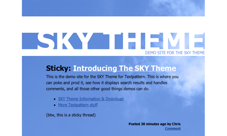
Screenshot of SKY Theme

Prompted by the Textplate theme design competition I started looking at what it would really take to make a clean and pluggable theme for Textpattern which at the moment doesn’t have a formal theme engine. Having come up with something that is both an interesting (or at least different) design and something that is pretty clean on the back side of things I’m officially releasing the SKY Theme into the wild.

While I think it looks good in addition to it being sound technically, but I’m not trying to kid anyone here. I’d be delighted to see people using it on their blogs, but it does have a heavily HTML geek driven aesthetic and I’m don’t think that translates well to the universal appeal that a great theme would have.

Google Page Creator – Does This Make Them Evil?

“Create your own web pages, quickly and easily.”

That’s the lead in on the new Google Page Creator site.

“No technical knowledge required. Build high-quality web pages without having to learn HTML or use complex software.”

From the output of the tool it doesn’t look like the developers had to spend much time learning either. To be fair, it is outputting better code, then, say, iWeb, but there is still quite a lot of cruft and divitis, not to mention the basic validation errors in the templates/hacks they include, the element nesting errors (<div> inside <h1>) and the <font> tags. <font> tags? Woe is me.

Here are a few examples that friends built in the wee hours of the morning:

Drew, of the eerily apt all in the head has written up his experience and has more words for Google.

[A combination of no coffee in my system yet and a bunch of errors when trying to use the site to generate my has contributed to the snippiness of this post.]

UPDATE: I finally got though and created.. you guessed it… placenamehere.googlepages.com. Also came across some more examples linked above.

Technorati Favorites: Another Thing To Maintain

Tuesday saw the launch of the latest tool from Technorati – Favorites. Independent of any other watchlists you already have this new Favorites feature allows you to track up to 50 blogs by name and display the entries in the listing style so common elsewhere on the site. Derek Powazek announces the launch on the Technorati blog.

Its interesting, but only mildly useful to someone who already is quite comfortable tracking specific sites in another feed reader. I’m curious what the longer term implications are with the information gleaned from who gets favorited on the authority system also recently unveiled.

The thing that they could do to make it (and the other Technorati features) more useful to me is to come up with a Newsvine like “Watchlist” page that includes all of the listings from my various favorites, watchlisted tags, my own blogs and anything else I mark in some way presented in an easy to skim format. Pull it all into one starting point so I don’t have to go chasing it down with a dozen or so clicks. More often then not I don’t end up using things like my watched tags for just this reason.

All that said I’ve gone and setup a few blogs on my favorites list just to try it out. Works great and I’m glad it offers combined results unlike the watchlist. One thing that bothered me a little was that it was quite easy to get an incorrect address added to my favorites when not entering the full address to a blog in the “Add a blog URL to your Favorites” field. When entering http://domscripting.com/ and http://domscripting.com/blog both take without questioning that there isn’t a ‘blog’ at one. Might just need another step to say “did we find the right blog, if so, add it”. But that is certainly a mild gripe.

It should be no surprise where my favorites can be found, loaded with 15 blogs I enjoy reading.

Ma.gnolia Day One

I’m still poking around and seeing what is what, but I figured I’d mention that the latest social link finding and bookmarking site Ma.gnolia has left beta and is now open to all.

I can’t say its really something I’m was looking for—while I do use deli.cio.us I can’t say I couldn’t live without it. But the new site by Zeldman and others looks to have some nifty features that try and make it more of just a place to store your remote bookmarks.

Give it a try and poke around. And if you’re looking to fill your ‘friends’ list go ahead and add placenamehere as a contact1 .

1 placenamehere can also be found @deli.cio.us, @flickr, @digg, @newsvine & @o’reilly connection with varying degrees of activity.

Camino 1.0 Final[-ly Released]

Camino

I mentioned it in my link post earlier today, but being its first major release in far too long and the big official 1.0 it deserves a post of its own. Camino 1.0 is the Mac OS X browser with a native Mac interface and the web standards support of Firefox.

As a web developer I have at least a dozen different browsers or versions of browsers installed at any time, but Camino has for some time been the one I use for my daily surfing and all but the most extreme development work.

What you can look forward to in the latest release:

  • Support for standards from CSS to SVG.
  • Updated interface including bookmark, download manager and tab changes.
  • Universal binary for those lucky enough to be on an Intel Mac already.
  • Address Book based form fill.

And two great additions that you can look forward to in upcoming releases:

  • Spell Check for in page forms
  • Feed Discovery that allows subscription to Atom & RSS feeds in your existing feed reader (like NetNewsWire)

Camino 1.0 Features

Camino 1.0 Release Notes

8 Links: V-Day On The Web Overwhelms

If Valentine’s Day isn’t enough of a distraction on its own, the amount of great stuff that hit the web today is further proof that the gods really don’t want you doing anything today. I’ll post deeper looks at some of these later today, but for now here are 8 links worth checking out.

Ten Simple CSS Tips

After deleting the 1,400 some odd unread emails I had waiting for me from the css-discuss mailing list I am again able to read the list without feeling overwhelmed. At least until the mails pile up again after a few weeks.

But why would you care about that? Well, shortly after I did that I noticed an interesting request from Scott Wilcox for people’s top CSS tips. So I figured I’d take a shot at seeing if I could come up with 10 hints that would be useful to people at all levels of CSS knowledge. Here’s what I ended up with, is there anything I missed?

  1. Evaluate and clean up your markup before attempting to style anything.
  2. Start all your [base] style sheets with * {margin:0; padding:0; } and only add back what you need where you need it. This cuts down tremendously on the need to fight differences between default browser style sheets and your own layouts.
  3. Use plenty of test styles like extra borders or background colors when building your documents or debugging layout issues. div { border:1px red dashed; } works like a charm. There are also bookmarklets that apply borders and do other things for you.
  4. Learn how to use Firefox’s DOM Inspector or similar tools for other browsers to inspect both the document tree (DOM) and the style rules that are applied to each element.
  5. Move ids and class naming as far up the document tree as you can and leverage contextual selectors as much as possible. Don’t be afraid to be verbose in your selectors. Longer selectors can make css documents easier to read while also cutting down the chances of developing class- or divitis.
  6. Create a page of sample content that contains all of the HTML tags you can think of in different situations (nested lists, block quotes, pre formatted text, definition lists) and use that to check your style sheets for completeness
  7. Never add graphics via <img> that you can style with background-image instead but don’t forget that <img> are in some cases legitimate content.
  8. Learn what a containing block is and how position:relative can manufacture an origin for you.
  9. Don’t get caught up in a desire to “hack” using browser targeted syntax filters or use “tricks” like image replacement techniques
  10. Play. Play with background images. Play with floats. Play with positive and negative margins. Play with inheritance and cascading rules. Play.

[For a much older piece on a similar topic see A Quick Guide To Making Style Sheets Work.]

UPDATE: Translator to the stars (and the WaSP), Kazuhito Kidachi, has translated this post to Japanese.

IE7b2p CSS Shortcomings And Info

I’ve had a little time to sit infront of the current IE7 preview and while I can say I’m happy that nothing drastic is broken I’m still a bit dissappointed in the state of its CSS support.

  • :before/:after not being supported
  • min-width, max-width, and related height values not supported (yet?)
  • the inherit and transparent unit value still missing
  • still some oddities in its vertical line box

That said, I’ve got to keep telling myself that is only a preview and that they’re still working on things. Eric does a good job at telling me not to panic as well.

For more make sure you check out:

NN4 Dead and Britney Spears uses Firefox/1.5

The monthly update to the ChunkySoup.net Zeitgeist as well as the report for PNH have been posted. No huge changes to report over the last few months, but I think one can officially call NN4 dead. Making up 0.15% of hits on ChunkySoup.net and 0.02% – just 27 hits total, same as the previous month – on PNH. Even Sony’s PSP has been recording a larger share.

So what’s going to change around here with the death of an old browser? Nada. Outside of possibly the end of breaking it out into a separate line item it won’t change anything.

And with that I’ll leave you with this interesting celebrity fact—brought to you in the form of the UA String of the month:

Britney Spears uses Firefox/1.5

New Script And A New Browser

Just two quick items worth passing along…

PPK has just posted a nifty javascript funtion called getElementsByTagNames() that takes a list of tag names and returns an array that contains all elements with these tag names in the order they appear in the source code. (via DOM Scripting TF Blog)

And there seems to be a new kid on the Apple browser block—Shiira. Its a Web Kit based browser with a UI that attempts to imporve on the basic Safari UI. More competition for OmniWeb I guess. Comes complete with page curl action though I’m not sure what use that is other then providing fodder for the ‘lets make fun of mac users and their silly playful UI’ crowd.

That’s all for today.

Now go outside and play!

Hixie On HTML Parsing

Waist deep in an ongoing effort to write a spec for parsing HTML documents Ian Hickson asks offers up this Tag Soup riddle asking what should the DOM look like for the following invalid code:

<!DOCTYPE html><em><p>XY</p></em>

The answer as you’ll see in his brain dump isn’t simple nor obvious.

Now if your head isn’t spinning after reading through that you should also take the time to read through his post from a few days ago where he started his parsing related brain dump. And if it is, well, take two aspirin, but also at least take a look at the little utility he wrote and used in both these posts—Live DOM Viewer—where you can drop some markup in and instantly see the DOM tree represented.

I[ron]EEE

Kimberly Blessing just passed me a link to the relaunched IEEE site to me. In the line of recent failed redesigns its a formal standards organization that clearly doesn’t get the standards of the web.

Some of the faults at first glance:

  • Heavy use table based layout methods with little thought towards sematics.
  • Forms that don’t reflect the use of standards to develop more accessible forms.
  • An odd use of short tags, css and other newer techniques amidst it all.

They’ve somehow managed to take every possible way to build a page and lumped them all together into some futuristic pill-form of tag soup.

I do have to give them a tiny bit of credit for not using a doctype and thus not advertising to the world that they’re shipping something that conforms to any DTD at all, but that really doesn’t account for much.

[Oh the irony! IEEE site not standards-compliant by Kimberly Blessing.]

Microformats Plugin For Textpattern v0.8 Released

Spent some more time on hacking away at Textpattern and pnh_mf this weekend and have a new release to show for it. Aside from a few minor bug fixes I have included new admin side dialogs for building proper TXP tags. These dialogs work just like any other TXP tag helpers already in Pages and Forms editors, but are also available for the article editor.

I still have a few more items on my to do list to knock out, but the tag helper popups should make this a ton more useful—both for people who know what microformats are and those that don’t—so I wanted to make a release now.

Download the latest version.

Front End Architect?

In an interesting addition to the ongoing discussion of the definition of a Web Professional Garret Dimon chimes in with a lengthy post titled The Time is Now for Front-End Architects.

While he says a lot we all already know, his attempt to outline some concrete skills and attacking the issue from both directions (designers and programmers) makes it a worthy read.

When it comes down to it, we have a bundle of technologies that are inter-related with very few people really digging in to understand the relationship between them all. Unfortunately, the real value of doing something correctly is the ease of maintenance and long-term adaptability, and in the heat of the moment, it's easier to just look the other way and slap something together. For some, that may be an acceptable way of doing things. However, for most of us, that's a poor decision, and generally unprofessional.

Also, if you missed it when it was going around last week be sure to read Joe Clark’s piece on Failed Redesigns—a must for both web professionals and business owners alike.

Safari [DOM] Inspector

Its great to wake up and see something totally unexpected in my feed reader. This morning was one of those times.

The folks at the WebKit blog has just announced Safari Web Inspector which is a compact UI device to examine the structure of a web page in depth (element properties, styles, etc.) by clicking from element to element. Those familiar with Mozilla & Firefox’s DOM Inspector will know exactly what I’m talking about. (And those not, see here and here).

The Web Inspector has been checked into the open source WebKit project and is available now if you download a nightly development build.

Introducing The Textpattern Microformat Plugin

I’m happy to announce the release of my first plugin for the Textpattern blogging system—pnh_mf—that allows for simple inclusion of common microformats including hCard, hCalendar and XFN.

The new tags can be used in page templates or page and post content or reused via forms. Here’s an example event entry for SXSW:

which was generated by the following tag:

<txp:pnh_mf_hcalendar summary="SXSW" location="Austin" href="http://2006.sxsw.com/" dtstart="20060310" start="March 10" dtend="20060320" end="19, 2006" />

Documentation and download of version 0.5 can be found at pnh_mf’s permanent home.

I’ve also put together a short Textpattern Resources page.

The Future Of XML-RPC In Textpattern

The official Textpattern dev blog has a nice new post on upcoming support for XML-RPC. which will ‘soon’ be released as a separate package for 4.0.x and then moving into the core product.

  • It uses Simon's IXR_Library which has been included in Textpattern for a long time, so no completely new RPC-libraries are required for textpattern.
  • There is a new “wrapper“ to invoke specific Textpattern functionality which could be used in the future to add implementations of an atom-server, atom-clients or moblogging tools.
  • Blogger API's template related methods are also implemented, this means you can edit your templates using a desktop XML-RPC client.

Its part of their Ask-A-Dev series which is still accepting questions.

The BBC Introduces Their RSS Feeds To Mom And Dad

The Feed Factory: RSS. Made Really Simple

A nice overview of what feeds are, what they contain, and what you can do with them written for the general BBC audience. Done well, its missing details of one important step—helping people actually get an app running somewhere handling the feeds you can now find.

The BBC does not have its own feed reader, but there are lots of different sites which review and recommend various readers. If you search for “feed finder” or “RSS reader” in your search engine, you will find some of the more popular ones.

While there are a great number of readers, aggregation sites, and browsers that handle subscriptions to sites it still feels like there was a chunk missing out of this otherwise good presentation.

[via Jeff Jarvis]

Tim Bray On Creating XML Languages

Hot off of Atom becoming an official standard Tim Bray has posted two great pieces over at Ongoing, both worth your time. Don't Invent XML Languages a Why Not To on creating new standards, and a followup, in cases where you really have to, On XML Language Design which hints on a few technical and non-technical gotchas with the process.

To the Managers Out There · The next time one of your technical superstars comes into the room and says “We gotta design an XML vocabulary for X”, make them prove they can't do it with one of the Big Five. And if they can prove it, sigh deeply and budget a couple of years' delay, and a few thousand more engineering hours.

Newsvine Impressions

Informed last night that I was one of the invitees to the closed beta for the new news site Newsvine I signed up for my account and have been poking around in my free time today.

Its clean, its nice, its easy to use, but I’m not sure I’m sold on it being an indispensable news source just yet. Like everything else in the “web 2.0” genre it requires participation and a critical mass of users for it to hit its stride, and I’m just not seeing that yet. Once it gets going I’m sure it will offer more—but that begs the question more of what? There’s a danger I see of it becoming too close to other offerings out there be it technorati, de.li.cio.us, digg, fark or even a yahoo news most popular.

There’s a lot there to work with, so I’m not going to write it off yet, and if the participation and discussion grows—if if they add a few features like pages built on the fly based on all the items that get brought in with your various watch lists it’ll be able to make its mark.

For more info, including screen shots, Solution Watch has a good rundown up.

Introducing Etna, An XML Editor

With a simple FAQ, Glazblog introduces us to a fledgling XML editor based on the Mozilla framework called Etna.

What is Etna ?
Etna is a Wysiwyg XML Relax-NG-based document editor. It requires almost no XML knowledge from the user and we focused on user-friendlyness. We built Etna with the same spirit we built Nvu.

Sounds great, and from a quick spin on my Windows box with the Tinydoc schema extention installed it looks like there’s some real potential here, and its making my Powerbook a bit jealous. (Where are the Mac binaries?)

New Year Brings Old Work

Just some minor updates around here…

First off is an upgrade to Textpattern 4.0.3 which doesn’t mean too much to those of you visiting this site, but adds some security patches as well as some enhancments to the comments backend and admin area (to combat comment spam).

Also, with the end of the month comes time to post new usage reports for both PNH and ChunkySoup.net.

User Agent String of the month:

W3C standards are important. Stop fucking obsessing over user-agent already.

Um, thanks for the tip!

And as always take those numbers with a pile of salt, not only are they specific to the audience(s) that visit my sites, but as hard as one can try theres only so much that can be done to combat referrer spammers or other cases of spoofing otherwise valid UAs.

Monday's Reading List

Running around a bit today so just gonna pass on a few links worth reading…

Why Is My Form Suddenly Invalid?

Another simple but impressive offering from the 24 ways to impress your friends advent calendar.

Today, the 13th, Roger Johansson offers up Transitional vs. Strict Markup.

If you’re looking for an HTML vs. XHTML fight this isn’t it. Instead he covers the less talked about choice between the “Strict” and “Transitional” variations of either. Though not intended to be comprehesive he does offer a very good list of ways the DTDs differ including:

  • Elements that are not allowed in Strict DOCTYPEs
  • Attributes not allowed in Strict DOCTYPEs
  • Content model differences

Yahoo!, Buy Me Next!

Yahoo! appears to have continued along the road of buying up hot internet properties with today’s announcement that it has aquired del.icio.us. Congrats to another fine dev team for (maybe, haven’t seen the numbers) having their hard work pay off.

And so far, Yahoo! has shown it is pretty good at handling these smaller services without totally screwing them up, so as a del.icio.us user myself I’m fairly optimistic.

(Word of the sale comes from this post on the del.icio.us blog)

Best Of This Year's Web

Its that time of year again where voting is up for the annual Weblog Awards. Josh Katinger, a friend from my time at RIT, sent around the following request which I’m happy to endorse and pass to you all:

The auto racing weblog that I started in 2003 and that I now run with the help of a bunch of other people, www.FastMachines.com, is up for an award — “Best Sports Blog.” This particular honor is bestowed via popular vote. Anyone can vote once inside a 24 hour window (from a particular computer — i.e. home AND work computer). The voting is from December 5th - 15th.

We would really appreciate it if you would support us in this effort by clicking the link below and giving us a vote. We're the only racing blog in the category and we would LOVE to beat out all the other “ball sports” blogs.

Thanks in advance! Here's the link: http://weblogawards.org/2005/12/best_sports_blog.php

Notably absent from that list are HockeyBird, PuckUpdate, Battle of Ontario or any other hockey blog worth reading. All the more reason to throw your vote Josh’s and FastMachine’s way.

I Need To Get On This MySpace Thing

It seems I’m always the last one in on these trendy things. Family members are on it. Bands are on it. Even Slashdot has covered the explosion in its use (and you know you’re losing touch when Slashdot gets there first).

But the last straw came today when I learned that even crazy Whitehouse fence jumpers are on MySpace.

[AP on the incident]

Not Your Grandmother's Advent

Dean Edwards Drew McLellan has launched the web geek’s version of the advent calendar at 24ways.

I'm excited to announce one of the things that's been keeping me busy lately. 24 ways to impress your friends is a festive blog designed to act a bit like a seasonal advent calendar. Instead of counting down the days to Christmas with little cardboard doors, allow me to present 24 web development tips and tricks from myself and my good friends.

Each day from now until 24th December, we'll be publishing a new short article or tip designed to teach you something that perhaps you didn't know, and in turn can share with your friends. It's a holiday thing — share the lovin'.

Behind the first door: Easy Ajax with Prototype by Drew himself.

Behind the second door: An Explanation of Ems by Richard Rutter.

Behind the third door? You’ll just have to wait until tomorrow.

And no peeking!

Tuesday Night Quickies

A few things worth noting tonight as I get ready to shut down for the night…

You’ve probably seen mention of it in most of the geek news sites (and even the more mainstream press already, but if you haven’t… The Mozilla Foundation, or Corporation, or whatever the internal structure over there is this months has released Firefox 1.5 along with an updated website to match.

Over at ALA there’s an interesting new article by Bert Bos & Håkon Wium Lie on their use of HTML and CSS to write and publish a recent book. Printing a Book with CSS: Boom! goes into detail about the project, covers some gotchas, some roadblocks and ultimately a new microformat. Its a good read for CSS junkies and others looking for an idea of what is to come when dealing with a system that supports HTML + CSS2.1 + CSS3 but not sure how applicable it is… yet.

For you entrepreneurial types take a look over The Startup Kit, a list by Nick Denton of worthwhile links to equipment, programs and services for a small business startup.

And closer to home I’ve fussed with some of the styles , leaned up commenting a bit and installed mic_technorati_cosmos the Technorati Cosmos plugin for Textpattern which you’ll see show up when individual posts are talked about elsewhere on the web.

Tantek Explains CSS Hacks

If you have ever touched a CSS “hack” Tantek’s latest post Pandora’s Box (Model) of CSS Hacks And Other Good Intentions is a must read. He covers the why, how and what of his early hacks, offers some basics on what makes a good hack, and tries to help you understand what you’re doing when using hacks including the pitfalls.

Its the kind of background you’ll never get if you simply look at one of the many available charts and pick the code that has the right combination o green and red boxes.

Web professionals aren’t the only target for the post, he also has a few things to say to browser developers including those working on the forthcoming IE7 (for those who don’t know the history, Tantek at one time worked for MS on their Mac IE product).

If you support the child selector, now all of a sudden you have to compliantly support all the other properties/values of CSS2(.1) that authors have been successfully using with the child selector.

But given that several other browsers do so (otherwise authors wouldn’t be using the child selector), and thus the market has demonstrated this is not a problem, this is a reasonable expectation.

However, if a browser is somehow unable to do so, then the answer is simple.

Don’t implement that selector, until that browser is able to do so. IE5/Mac did so, so can IE7, more than five years later…

But back on the topic of you and I in the web dev business, to paraphrase the big takeaway of the post, CSS hacks should:

  1. Be valid.
  2. Target ONLY older/frozen/abandoned versions of user agents / browsers.
  3. Be ugly.

Given situations like the upcoming IE7 and well, years of people blindly using hacks without thinking about them just because they work, its a very worthy read.

On Craft, A New Professionalism And New Amateurs

There’s a discussion among some folks that has been going on over the last few weeks that I thought was worth pointing out for those who haven’t come across it. It has seemed to take two directions, both quite introspective and dealing with some of the same concerns. The main thread through it all being the definition of our craft.

There are now so many web sites, blogs or publications devoted to helping people learn standards and accessible techniques that there are now no excuses not to work with semantic code or CSS. Those people still delivering nested table layout, spacer gifs or ignoring accessibility can no longer call themselves web professionals. – Andy Clarke

Many of us, Old Professionals have been involved in mailing lists and online communities advocating standards, accessibility, guidelines as well as offering help, information, and resources for several years. We do it because we are passionate and believe in what we are doing. Advocating has not been easy, but it is rewarding and exciting to see change and understanding grow. We have been doing this since the mid to late 1990’s, and much of the early advocacy and information exchanges were the groundwork for all the excellent information and resources that exist today. We need to look outside of our web community and start working in other areas, too. – Holly Marie Koltz

Just in the last couple of days I have read no less than three articles that all bring up something I have felt for a long time: Web professionals who refuse to update their skills and insist on using outdated methods can no longer be called web professionals.

Some will call me an elitist for saying that. But think about it. Why should web professionals not be required to know their craft? I find that attitude — which is held by many in the industry and by many more outside of it — insulting to those of us who work hard every day to keep up with current best practices. – Roger Johansson

It look like many are itching both to clarify exactly what it is that we’re trying to accomplish when we talk with a mouthful of buzzwords like CSS, XHTML, Semantics, Unobtrusive JavaScript, Accessibility and do a better job at defining the product that it is our “job” to produce and measures of quality. Its not just about the pretty and the visual polish — we know that, but how many others do?

One topic but not part of the discussion yet is the education of the new clients. This can be difficult, and some may say irrelevant. After all, its the developers who can often do much of this work and have it slip under the radar of management who don’t know what things like View Source is. But if there are real advantages beyond making the individual coder’s life easier then we should be looking for new ways to articulate, measure and present those benefits to clients and stake holders. Again, we know how to define “quality”, but unless those funding projects can situations like the oft-cited Disney Store UK redesign will continue to be somewhat common because management is working off a totally different system of measurement.

Again, its about both clarifying the product that “web professionals” should be offering, what the benefits are, and then getting that information spread to all those people who have a stake in what it is we do. Its not a new question at all, but is it time to refocus on it and regroup? If so where do we start?

And if the above wasn’t enough I’ll leave you with a couple relevant asides:

All Your Base Are Belong To Google

Hot on the heels of their Google Analytics announcement (which is now hooked up and running on ChunkySoup.net for eval purposes) Google has launched Google Base the [re-]classified ad [and other content] search site. I think. Unlike other Google product this one seems to fairly indirect about what its supposed to do:

Google Base is a place where you can easily submit all types of online and offline content that we’ll host and make searchable online. You can describe any item you post with attributes, which will help people find it when they search Google Base. In fact, based on the relevance of your items, they may also be included in the main Google search index and other Google products like Froogle, Google Base and Google Local.

Um, and? Maybe they just haven’t finished with the copywriters yet… (pokes JP).

Well, if you’ve got some time check it out for yourselves, but it looks to me like this one needs a little more time to bake.

P.S. to you business oriented folks the Analytics site has some companion articles up on traffic driving and conversion that are worth a look.

P.P.S. Sorry about the post title, its bad, I know, but I couldn’t resist.

Camino 1.0b1 Posted

My long time favoritest Mac browser1 is getting ready for a the first stable release in a looong looong time. In reality the nightlies and alphas have been stable for months, and I’ve been using it for my daily surfing for some time, but with the upcoming stable Firefox and other Mozilla releases they’re planning on a 1.0. Here’s the announcement.

1 Hard to pick favorites when there are 83 of them

'Nother Month, 'Nother Report

Time again to run my batch of scripts over my server logs and post up some of the resulting reports here and here

Interesting things seen last month include early sightings of Opera 9 and IE7, and a fairly big post September drop in traffic for PNH following the annual activity around my 9/11 photos.

Besides traffic, this past month was lacking in fun UA strings… most interesting one I ran across while skimming the reports was:

Mozilla/1.10 [en] (Compatible; RISC OS 3.70; Oregano 1.10)

Yahoo! Maps Revamp

Google isn’t the only monstrous web company out there. Showing they’re still looking for a fight Yahoo! has rolled out the next generation of Yahoo! Maps.

From the Yahoo! Search Blog: Yahoo! Maps: drag ‘em, search ‘em, hack ‘em:

We’ve got your Flash and AJAX here…

Our launch wouldn’t be complete without developer APIs. We’ve got stuff for hard core hackers and map enthusiasts alike:

  • Simple API. To get a custom Yahoo! Map up and running with our Simple API you need only a text editor and a web site.
  • JavaScript-based APIs for Flash or AJAX let you choose the tools you’d like. You can host the maps on your site and include any features you like. Grab an application ID and get started with Yahoo Maps APIs.
  • Building Block APIs make a lot of the heavy lifting easy. You get features like geo-coding, Yahoo! Local, traffic information and map images.

And Jeremy Zawodny chimes in with coverage of the Yahoo! Local Events Browser Demo seen here.

Flickr Photo Finishing

To all my Flickr Friends & Family members check out my photos and order all the prints you’d like. (you know ‘prints’? those old papery things?)

Staff member Stewart Butterfield announced that starting today Flickr is offering photo printing services. I’m happy to finally see this, and while I haven’t had the need for any prints made its always one of the first things I’m asked about when I try and set up a friend or family member with an account.

Photos look to start around $0.20 each and can be delivered or ordered for pick up at your local Target store. And like other organizing tasks, you can set the restrictions on who can order prints of your own photos between yourself, contacts or anyone. Check out the Printing FAQ for more.

Paparazzi! Update

Wevah has done it again and updated the nifty OS X utility Paparazzi!.

Paparazzi! is a small utility for taking full length screen grabs of web pages. The latest update adds support for saving captures as PDF, and added a paparazzi: url scheme to allow for launching from a browser via bookmarklet as well as some other changes and bug fixes.

Flock First Impressions

First Impression: Nice idea but needs refinement. Flock, if you haven't bumped into the hype, is a new “social&8221; browser based on Mozilla.org technologies. Wraps up a bunch of so-called web 2.0 products (flickr, blogging, del.icio.us, feeds) along with your old fashioned view of the web into one user interface. Missing features aside, it just doesn't feel natural — yet. A few too many times I've either accidentally done something (bookmarking something when i wanted a context menu) or had to work too hard to do something I would have though would be seamless in the product. But those things I'll give some time and user feedback to get worked out. As for missing features, heres a few initial bugaboos: * No initial bookmark or other data import from Camino (my normal browser of choice). * With the del.icio.us syncing features it looks like some of the bookmarking features I'm used to in Camino or Firefox are missing — most disappointing is the apparent loss of bookmark keywords. * The bookmark integration seems like an all or nothing proposition. Maybe I'm an odd sort but I have many local bookmarks to machines that can't be accessed by an outside network, private bookmarks to admin interfaces here or there, bookmarklets, or other such things that I wouldn't want to share with the world. An extra &8220;publish&8221; layer here would be greatly appreciated. * A feature more of my choice in blogging tools then anything the Flock team could have done, but by using their interface to post I'm not getting access to any preview of my posts run through Textile. Sort of a pain for consistency — especially if I'm moving between the native web interface and the XML-RPC facilities. On a big positive, the core browser functionality seems as solid as I've seen Firefox be, and they haven't really broken anything on the way to adding the new tools. That's a real good place to be during these early preview stages and gives them plenty of room to focus on cleaning up the new tools going forward. EDIT FROM TEXTPATTERN: Well, I guess I need to work on the textpattern integration a bit. Kill the formatting from flock, run textile, and find a way to get category picking working.

Call To End (some) CSS Hacks

I've mentioned my concern over existing hacks and reliance on them may be impacted by the pending release of IE7 before, but now the official IEBlog has posted Call to action: The demise of CSS hacks and broken pages.

Here is a list of common CSS hacks to look out for (please also consider their variations):

We ask that you please update your pages to not use these CSS hacks. If you want to target IE or bypass IE, you can use conditional comments .

Sure, that's wonderful, and something that has been looming as a caveat to hack use since the first hack. But the post totally glosses over the reason many pages may now fail if they've used these hacks — that MS has fixed some, but not all of their CSS2 support. Just look at the example I used in that past post (happens to be the same one used in the first comment on this latest IEBlog post). If you fix the parsing of selectors, but don't fix the support for all of the rules that were being hidden then the page you're viewing is broken because IE7 is broken.

Kill Them With Freebies

Got my most recent order from bookpool yesterday containing lots of good solid reading for the next few weeks. What I saw in the box made me cringe (and wonder if maybe I need some help, heh).

Bookpool Bookmark

Once I got past the awful blurring which I can kinda deal with coming from a freebie from a tech book distributor, I noticed the aged and ugly markup being used! Its almost as bad as programming tutorials that ‘teach’ you the language by having you explicitly code for bad & embedded markup.

As for the books, the reason for the box arriving in the first place, all was good there:

PHP 5: Your visual blueprint for creating open source, server-side content by an old friend Toby Joe.

Agile Web Development with Rails was in there too, and though I don’t have an immediate need to leave PHP development for Rails the idea of using a good MVC architecture for web applications has always been one I’ve been fond of – even if my first exposure to it was with Java.

And, at the bottom of the box was We The Media, Dan Gilmor’s tome on grassroots journalism.

Free Opera Tickets

Opera is Free!

Thats right, and this time its more then a one day “Happy Birthday” stunt.

Yes, you read that right. We’ll say it again: Opera is free. There are no more ads, no more registration, and there has been no better time to try the best browser on the planet. From this point forward, you will be able to download the full Opera browser for free from the standard download page. We hope you are as excited as us about this new release.

Over the years I've had a few licenses, and, even without I didn't mind them much, but it has never been my primary browser or used to the point where they got on my nerves. But Im glad they're doing this, I'm sure there are a pile of folks out there who haven't bothered to download because “why bother when there are good and FREE alternatives” and now they don't have that excuse anymore.

Ramblings On A Multi-Site Textpattern Install

A while back, after running Textpattern on Place Name Here I got the bright idea to duplicate or syndicate (or whatever you want to call it) the web tech related postings over at the more focused ChunkySoup.net as a way to freshen that place up a bit. Sure, I could have just parsed the Atom feed from the originating site and then drop the results on the homepage of the other one, but what fun would that be… and it wouldn’t be particularly friendly either.

And thus began the Textpattern hacking.

Updating The Plumbing

Sorry for the brief interruption (if anyone noticed), but I needed to update the code and database behind ChunkySoup.net and PNH to the latest and greatest build of Textpattern and since I have done some modifications it takes a little bit more then just unpack and run the updaters. But really, it isn’t too rough of a process and I’ve gotten my hacks to a point where they’re pretty clean after doing it two or three times now.

Anyway, both sites are up now (was only about a half hour of downtime) and seem to be running just fine. If you notice anything odd please drop a comment. Oh, and look for a rundown of what it takes to get Texpattern running on the two sites simultaneously sometime later this week.

Local Textile Via Ruby

Drew McLellan offers up a great explanation of how to run RedCloth (the Ruby implementation of Textile) on your Mac – including simple install instructions, as well as setting it up to run as a script inside TextMate.

Great timing as one of the things on my to do list was to look for a cleaner way of handling things like special characters on the occasions where I have to hand edit a page’s content.

More IE7 CSS Info

The official IEBlog this week brought us news and details of some of the future changes to te IE CSS parser to go along side of what we already know about their planned changes to standards support.
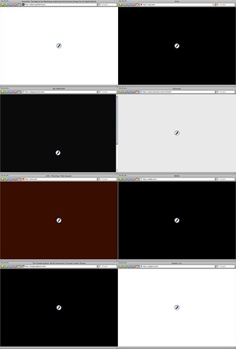
We’ve already started talking about a few of the CSS changes that are going to be available in IE 7 when we release, but there are a few hanging points that we haven’t talked about yet or haven’t covered completely. There are 3 specific items I’d like to talk about:
  • Using the root node wild card selector for IE only rules (* HTML) [strict mode only fix]
  • Multi-class selectors as defined by CSS 2.1 (.floral.pastel) [strict mode only fix]
  • Pseudo-element parsing sometimes flags rules as invalid (P:first-letter{ color: red; }) [strict/quirks mode fix]

This is good news for the future of the browser landscape allowing developers to do a lot of things that we may not have the ability too, but more often have had to work around in some fashion adding unnecessary bulk to code.

But it does raise some important concerns about compatibility of existing code and the use of so called “CSS hacks”. Myself, while I’m really not a fan of littering my documents with CSS hacks and try to avoid use of them at most costs I do find that I often use some of the simpler ones like the use of selectors that IE5 & IE6 may not understand to change or add some extra styling. Here’s a simple example to deal with IE’s lack of min-height support:


div { height:200px; }
body>div { height:auto; min-height:200px; }

Now, this makes perfect sense during the era in which we had one class of browsers that supported both min-height and the child selector and another class that did neither. But if there is no min-height support in IE7 (one thing I have not seen mention of yet) then any pages out in the wild may “fail” in one fashion or another as IE7 picks up on the respecified height, but continues to ignore the min-height declaration.

August Browser Reports

Just finished running reports on August’s server logs and have uploaded the new PNH Zietgeist and ChunkySoup.net Zeitgeist. Not too much movement to speak of from the previous month, well nothing out of the normal flux that small sites have. A few new UAs spotted this month including IE7 Beta, and I’ve cleaned up the scripts behind it all a little more and have included robot data used in the vBulletin project.

CSS Basics, Again

It has been said before, and it’ll surely be said again, but one of the most important steps to understanding how to build web sites with HTML & CSS is the ability to step back from old ways of doing all the work in the HTML document and being able to separate the content from the display.

This week its Meryl who comes in with a short piece on how to approach designing the marked up document and then adding the presentation layer.

If you’re looking for something profound to be said about the topic, you won’t find it there. Its just one of those topics that needs to be reiterated until you ‘get it’.

More Web Dev Goodies

Wevah has recently taken over development of the OS X app Paparazzi! and is already putting out some great changes. This is a great little app for taking screenshots of web pages (like this one) as they appear in WebKit browsers (like Safari or OmniWeb).

Dean Edward’s CSSQuery is a cross platform Javascript function that allows for complex selection of HTML elements based on CSS selector syntax. An easy way to grab a collection of elements of with a given class name, but also allows for selection based on more complex CSS2 or 3 selectors.

And finally, from Cameron Moll comes Mobile Web Design a 4 part piece on, well, web design for mobile devices.

A List Apart Relaunch

Perennial favorite A List Apart is back with issue 201, a redesign, and much more (but wheres my Atom feed? hehe).

I’m a bit biased as I’ve long been a reader, since before it was a website, but it looks great and from my first experiences it seems to have all the great things we’ve come to look for in ALA – and in some incarnation not find. Oh, and its own Threadless store too…

This issues’ articles include When You Are Your Own Client, Who Are You Going To Make Fun Of At The Bar? by Jim Coudal, Facts and Opinions About PDF Accessibility

and Zeldman has a nice feature covering the history of ALA as well as details on the new site.

Happy Reading!

JJG Interviews Eric Costello On Flickr

Great interview with Eric Costello of Ludicorp (or is it yahoo?) and glish on the history of Flickr, its wild growth, the reasoning behind the move from a Flash front end to a JavaScript driven one, and a bit about the interesting development processes used when designing new features for the site.

They also covered Ludicorp’s earlier project, Game Neverending, which I had a ton of fun with and kind of wish still had life.

Eric is also co-author on Cascading Style Sheets: Separating Content from Presentation a book which I was glad to have tech reviewed for the publisher, Glasshaus.

Busy Software Month

… and I’m not talking about more IE rumors. Been meaning to mention a few packages being released recently, and haven’t gotten to it so here’s a bit of a wrap up.

Mochikit 0.60, a nice lightweight JavaScript library was released at the end of last month. Though a new library its well on its way to becoming a solid set of tools covering everything from DOM manipulation to AJAX requests. Some tutorials and good docs available at the site.

Textpattern 1.0RC5, the software this site and many others run on (though I’ve hacked it up just a tad, hehe) has been posted and it looks like its well on its way to an official 1.0final.

And not as new, but I’ll be having a bit more time interacting with it and perhaps writing extensions for it eventually, I thought I’d bring up Lussumo’s Vanilla Forum package.

UPDATE: Mochikit 0.70 Released

Reports And More Reports

|

Another month and another update to both the ChunkySoup.net Zeitgeist and the PNH Zeitgeist based on hits from July… Not a ton of movement on the usage from month to month, although the general trend of IE slowly slipping continues.

Award for best UA String for the month of July:

dffvncfxxfddxzdbabadbAbadbadgdgfggggffgffryrttrj,j,jsdsDSH

HFHTTHHHGGGJJTJJGFTSDTHDTTJJYJYJYTYRREQQERYTK,,J,JFJ,HJ

J,J,JJJJJKJHGHGHGGHKHJHJHGFGFXXXXXXXXXXXXXXXXXXXXXX

XXXXXXXXXXXXXXXXXXXXXXXXXXXXXXXXXXXXXXXXXXXXXX

XXXXXXXXXXXXXXXXXXXXXXsdgdgdgasbdsdgdsgfdnbmgfhg56

Award for worst UA String for the month:

Mozilla/4.0 (compatible; MSIE 4.01; AOL 5.0; Mac_PPC)

Feel so sorry for whoever is on the other end of that connection.

Obligatory IE7 Beta 1 Post, Part 2

More from Chris Wilson over at the IEBlog about the changed they’re implementing in standards support that will be seen in IE7b2:

In addition we’ve added support for the following
  • HTML 4.01 ABBR tag

  • Improved (though not yet perfect) fallback
  • CSS 2.1 Selector support (child, adjacent, attribute, first-child etc.)

  • CSS 2.1 Fixed positioning

  • Alpha channel in PNG images

  • Fix :hover on all elements

  • Background-attachment: fixed on all elements not just body

  • There’s quite a substantial list of changes planned for beta 2, including the above. Ambitious plans indeed. Hopefully their goal of removing the worst painful bugs that make our platform difficult to use for web developers does indeed do that and doesn’t just leave us with a different set of difficulties.

    But I’ll be positive, and hopeful, and wait for beta 2 to see the light of day.

    Obligatory IE7 Beta 1 Post

    For those with their head in the sand the past few days, initial IE7 betas are out and the news from those who have gotten it and installed are mixed as anticipated.

    Dave wins the award for best write up for the web builder on the go with this post from yesterday, getting right to the point and outlining some good additions (PNG support), some shortcomings (little change in CSS) and some ideas of what to look for in upcoming betas.

    So what about the rendering? Things have changed, but obviously we were promised only very little for a reason — nothing much has been fixed. Yes, now we have PNG transparency. (compare Panic’s Audion Faces page in IE6 and IE7) Yes, the Peekaboo and Guillotine bugs appear to have been addressed. Though without having had a chance to test either very comprehensively, I’ll hold off on saying they’ve actually been fixed just yet.

    Other than that? After running through Position Is Everything’s “Explorer Exposed” omnibus, it seems to me that the list of outstanding IE bugs remains long. Line-height bug? Not fixed. Border chaos? Chaotic as ever. Italic overflows? Still buggy. Doubled float margin? Nope. 3px jog? Nuh-uh. Escaping floats? No way.

    And also includes this important piece of information from the official IE Blog (emphasis mine):

    The beta versions of Windows Vista and IE7 that have just released should be interesting to developers and IT professionals. For this reason, the beta is available to MSDN subscribers and a pretty small set of pre-enrolled beta test participants. Our goal is to get feedback from this group, do a bunch more work around quality (performance, security, reliability, etc.) and some features (e.g. additional standards support beyond what’s in beta 1, additional functionality around tabs and RSS, etc.), and release Beta 2 much more broadly.

    Molly also has a good write up if you’re looking looking for more.

    FlashObject 1.2 Released

    Geoff Sterns has just released v1.2 of his FlashObject script for embedding Flash content into web pages.

    FlashObject works quietly in the background of your HTML document. When developing pages that use FlashObject, you should start with your alternate (non-Flash) content first. Get your pages working without your Flash movies, then add them in later with little Javascript snippets that replace your alternate content with the Flash movies. This ensures that the alternate content will be indexed by search engines, and that users without the Flash plugin will still see a working HTML page. Whether you provide upgrade instructions or not is up to you. If your alternate content can suffice, there may be no reason at all to tell people they are missing out on Flash content.

    Documentation and more at its permanent home with mini FAQ and a few comparisons with other embedding methods including ALAs.

    Flickr Knows Customer Relations

    Though I haven’t noticed any myself, it appears Flickr has had some minor hiccups during its recent hardware move and other transitions related to being acquired by Yahoo!. So what you ask, why bother pointing it out, what makes this different or worth mentioning?

    Well, not so different for Flickr, but I thought it worthing of pointing out Stuart Butterfield’s posting this morning Sometimes we suck. In a way that few companies are capable of he comes off as honest, apologetic and and the same time speaks on the level of his customers instead of taking a much more polished and cautious approach to interacting with their users or otherwise trying to put a heavy spin on any issues that have come up.

    Its something one can read, nod your head in understanding, and most importantly be at ease about moving forward with their product. The approach wouldn’t work for every company, with any product, but it certainly has its place.

    Greasemonkey update and vulnerability details

    To steal a line from Haughey yesterday… If you understand what “Uninstall the monkey” means, you’re a nerd.

    Guilty as charged I guess.

    Fot those non-nerds out there, or those nerds that have been on vacation for the last week it looks like a fairly serious vulnerability in the Greasemonkey scripting application has been found and the call is out to upgrade or uninstall to lock down your Firefox install.

    So now that you’re up to speed (sort of) or are at least feeling a good bit nerdier, Simon Willison has posted a full explanation of the vulnerability, detailing how the use application code was opened up to cross site scripting vulnerabilities.

    Wanted: Notes For Mail And Feed Entries

    If any authors of either RSS readers or mail clients are listening heres a suggestion for you – where you allow flagging of messages it would seem to be to also all allow some form of note, label or tagging to be attached to that flag. Particularly with web feeds, or incoming mail from mailing lists I find that I pick messages to because they contains some useful information, a link I want to refer to later or other piece of information that I think I may want to follow up with.

    But what I seem to end up with in the end is an overwhelming jumble of flagged messages (either in Mail.app or NetNewsWire). Sure, each app then allows for searching or sorting of some kind, but I find I rarely simply browse the pile and rarely end up revisiting those messages unless I’m looking for something highly specific.

    Now, I’m not huge into the tagging phenomenon (though useful, I don’t feel the urge to tag everything I ever look at) but some method of tagging or simple comment system (“this is a really good solution to that problem you had on site xyz”) would be more then welcome in these type of apps.

    Alternatively, does anyone out there have any Mac solutions, different apps that would allow me to flag messages (or entries) and tack on some additional information to go back later? Mailing myself messages from lists is just so much of a kludge.

    Designing for AJAX

    There have been a slew of recent articles about careful incorporation of AJAX features into more traditional web based interfaces that I thought needed to be highlighted for those that haven’t yet seen them. In each the authors point out that care must be taken to not be too subtle because site visitors might not have the prior experience to pick up on changes inside the current page and instead may sit back and wait for a refresh or other indication that their changes took.

    Jeffrey Veen posts: Designing for the subtlety of Ajax

    Eric Meyer posts: Increasing the Strength of Ajax

    Alex Bosworth posts Ajax Mistakes

    Make sure to go through the comments at each site as well for some quality discussion and links.

    Simple Solutions Often The Best

    From Eric Meyer comes this wonderfully simple solution for dealing with Internet Explorer’s lack of support for the CSS child selector.

    #main * {background: #FFF;}

    #main * * {background: transparent;}

    Yup. That’s it. Makes a ton of sense, easy to read, and gotchas are relatively small. So into my toolbox it goes right next to * { margin:0; padding:0 } to set up a page.

    Connection Lost

    Been kind of quiet this week as I’ve been fighting a bad internet connection for a few days. Things I’ve missed, but wanted to mention include the transfer of ownership of BrowseHappy to the WordPress team, iCab and Konqueror both passing the Acid2 test, new infrastructure for Apple’s WebKit, PHP’s 10th Anniversary and possible progress in the NHL labor talks.

    —- placenamehere.com ping statistics —-

    21 packets transmitted, 2 packets received, 90% packet loss

    round-trip min/avg/max = 596.414/825.062/1053.71 ms

    —- placenamehere.com ping statistics —-

    288 packets transmitted, 207 packets received, 28% packet loss

    round-trip min/avg/max = 78.105/101.944/1151.47 ms

    Yikes!

    Photoshop and the Intorweb Don't Mix

    In the middle of a local political battle comes Why Photoshop hack jobs and the internet don’t mix – reason #392729.

    From Politics NJ comes this little episode of an old campaign trail photo taken from the Howard Dean Presidential campaign and carefully (sort of) caressed into an image for the Bret Schundler for Governor of NJ website.

    Yeah yeah, anyone looking at that 2nd image can see its been faked (at least the superimposition of Schundler into the front of the crowd) but wouldn’t it be smart to not have grabbed the source crowd from something that could fairly easily be traced back to a recent campaign from the opposing party?

    Also covered in this NorthJersey.com story.

    More Stats And Other Disturbances

    I’ve just gotten around to updating both the PNH Zeitgeist and ChunkySoup.net Zeitgeist with data based on April’s usage logs. The update on the CS side is a long time coming. Which brings me around to something I’ve been meaning to mention about these sites I run.

    A few weeks ago, while mulling over what to do about the content on ChunkySoup.net and when and what more I should write about, I decided that instead of waiting to get around to a full blown article I would infuse it with some new web development content immediately. What I have done is to mirror all of the ‘web’ postings and links on PNH over there as well. Since I’m using Textpattern and both sites have access to the same database this was a fairly easy hack to do. Aside from a few gotchas there wasn’t much to do besides point the second install towards the few shared content tables and make up some new templates.

    So, if you aren’t interested in my slant on media or crying about the current situation in the NHL you may want to instead follow the new feed CS instead of “here”.

    (I guess “here” isn’t really “here” anymore is it. That will be the hardest part of the change for me, writing to appear on two domains.)

    Safari Passes Acid2

    Another update from Safari developer Dave Hyatt announces that Safari passes the Acid2 test. Additionally, the changes made have been posted so that khtml developers can take advantage of the work.

    More info from the WaSP:

    DH: Well, the great thing about KHTML is that nothing in the test was that hard to implement. Safari was actually already really close (despite the rendering in 1.3). The bugs were either just missing minor features, like support and min-/max- -width/-height on positioned elements, or minor details, such as slightly better handling of percentage values that end up not being used.

    Last Modified Is Not A Preference

    Lets say you were to create a web content management tool. In this tool you created a variety of tables, one to store article content, one to store comments, another to store links, and maybe one to store some preferences. In this preference table you had things like the site’s name, install path, and other assorted goodies, but because it was just another name value pair, and you didn’t have a seemingly better place to put it you decided to toss a time stamp for the last modified date of the sites content into that preferences table.

    Now lets say someone came along later and decided they wanted to run two or three sites sharing that same content, but with slightly different installs. They’d all point to the same content and take what they want from it or add to it at will, but each would have to have its own distinct preferences. But oh wait! There’s that one preference that needs to be in sync!

    /walks away mumbling to himself/

    Tell Opera To Take A Bath

    Run, don’t walk and go download the newly released Opera 8.0. Not just because its another solid browser out of the company that just never seems to get enough recognition for it, but also because of the just announced One Million Download Challenge:

    An overly excited Jon S. von Tetzchner, CEO, Opera Software, today proclaimed at an internal company meeting that if the download numbers of the new Opera 8 Web browser reach 1 million within the first four days of the launch, he will swim from Norway to the USA with only one stop-over for a cup of hot chocolate at his mother’s house in his home country, Iceland. Opera’s communications department could obviously not resist to make such a bold and inarguably over-confident statement public.

    The 4th day is nearly here, so don’t wait and go download.

    P.S. Hey Opera we know you’re smart, but the fancy platform sniffing when you click the download link, well, it doesn’t help give me something to link to and confidently get your Windows product.

    Acidic Safari

    I’ve been a bit quiet in regards to the Acid2 CSS tests being hosted by the WaSP, mostly because the bulk of what I have read and would have wanted to respond to has leaned towards the political and the hand-wringing as opposed to the more technical in nature so I thought it best to just sit on my hands rather then add to the noise.

    That said, tonight I caught the following item from Dave Hyatt:

    I started work today on making Safari pass the test, and I thought I’d blog my progress as I fix bugs in the test. This will be a fairly slow process as whole features may have to be added simply to make one row of the test render correctly.

    That’s wonderful news for both Safari as well as the web development community, and I look forward to reading about the trials and tribulations Dave goes through while making Safari a better browser.

    New Stats Up

    It seems I missed a month there, but fear not, the PNH Zeitgeist – a clash of unobtrusive DHTML and otherwise boring usage reporting – has been updated with new data from February and March.

    No new trends in the numbers, but did see a few new spiders coming online. Which begs the question, with dozens of “search engines” out there sending hundreds of spiders to index this site why do I only see referrals from half a dozen of them each month? Why do they all exist? Who supports them?

    Camino Release Followup

    Well, not that my comments yesterday had anything to do with it (or even read by pink) but theres some good news for Camino 0.9:

    As far as 0.9 goes, we’ve decided we need to shorten our timeline and get this baby out the door sooner rather than waiting for all the features we wanted. Nightly builds already have a lot of great improvements and we need to get into a cycle of releasing more often, not once a year. That means some features will have to wait, namely big ticket items like spell checking and autoFill (which, btw, is much harder than one would think). I know people have been begging for those features for a long time, but we can’t hold the world waiting for them. It’s better to release without them then never release.

    CaminoBrowser.org

    An old friend Wevah pointed me yesterday to a new site devoted to information, promotion and discussion of my own favorite browser to come out of the mozilla project – CaminoBrowser.org.

    Nice, clean and to the point. While including all the standard fair for a website from these days – from developer blog to downloads its not particularly boring. Even gets “personal” with me from the start.

    You appear to be running a recent nightly build of Camino. Isn’t life on the bleeding edge great?! Please report any bugs you find while you browse.

    I still can’t help thinking that what the project really needs is a release based off of the ages of amazing nightlies they’ve been putting out and not off the older more stable code, but I do see showing any outword signs of live in the project being a good thing. Keep it up folks!

    Web News Roundup

    There are a fair amount of things I’ve seen happen this week that I thought I should post about, but don’t really have much to add above what I’ve read elsewhere.

    First we have the rise of Ajax – no, not the cleaning product – the clever new name for a clever old technology. Jesse James Garret explains more about the combination of Asyncronous JavaScript and XML. SvN adds a little caution on the discussion, and just to round out the links to the old guard here’s what Jeff Veen has to say on Ajax

    But wait, there more links to old familiar names. Jason Kottke, who I think I mentioned for being under the gun for posting info on leaked Jeopardy winners info has recently announced he quit his job and will be living off his blog for the next year. The twist – he’s gone “listener” supported instead of the blogad route. For the next few weeks he’s soliciting micropatrons as he’s calling them to donate to the fund to keep him going. Coverage from Wired, & the Village Voice. Best of luck man…

    And one last tidbit for today, a new book by WaSP members David Shea and Molly E. Holzschlag The Zen of CSS Design is soon to be released and the digital press tours and reviews have started. Digital-Web has a review as well as interviews with both authors. Much more from David here.

    DevEdge back? Almost.

    Back in December I mentioned that Netscape’s old web tech documentation site was back. Well it was up, for a few days, then it went offline again.

    Now it seems like more progress has been made towards the Mozilla foundation gaining access to that content and becoming its new owner and eventually getting it back online and updated. Mitchell’s Blog has all the details on the old DevEdge content, the new DevMo, and a new Mozilla staff addition.

    Designer Stool Box?

    Getting back around to the tech topics here’s a new site to me… Designers Toolbox a site that wraps up some basic print info, web references and other info was an instant bookmark if just for the instant access to the Lorem Ipsum generator.

    The Other Chris' Toolbar

    Many folks have asked me if I plan on updating my ancient web developer toolbar for Firefox and other Mozilla browsers. My answer is usually, someday, but in the mean time check out Chris Pederick’s Web Developer Extension.

    Well, word has it that there is a new version of that toolbar with some bug fixes and a few additions. Check it out… while you wait for me to get around to mine… someday.

    Some Podcasting Thoughts & 'Casts

    Seems lots of folks are talking about podcasting again, and I have to say the personal radio show style broadcast that people are still raving about hasn’t won me over. But that doesn’t mean I’m not a big fan of what is going on – or of content that now is being made available.

    Opera Dresses Up Like Santa

    Touting it much awaited, Opera has released a beta of their version 8.0 browser for Windows. First glance over the change log and there looks like more of an emphasis on interface (including speakable commands on Windows) then rendering engine changes in this go around, but I haven’t had time to take it for a spin on my other machine yet.

    Merry Christmas web geeks!

    Boring Web Design… Formerly Dead Horse Revived

    Just came across a lengthy discussion on personal web design. The topic isn’t new but I do still agree with the premise that there isn’t enough experimentation with current technologies of presenting content via the web (although to be perfectly honest I haven’t been actively looking for it either).

    I think the biggest surprise for me in terms of this discussion taking place as we approach 2005 is that there still seems to be a lot of people who are using standards support in browsers as a major factor in the way they use (or not use) style sheets.

    Popularity of Browser Popularity Reporting

    Seems like browser stats are all the rage this month. A few weeks ago Tim Bray started posting ongoing’s weekly browser usage, and now Jeremy Zawodny has gone and pulled together a few other sites including his own. Jeremy raises a few questions about audience makeup (particularly that of blogs vs. ‘normal’ sites), and the impact of RSS, but doesn’t make much of an attempt to draw any conclusions. Then again, I don’t either.

    Abusing Margins

    Something that has come up time and time again, and then again a few times this week, has been the use and abuse of margins and padding in CSS based layouts. I thought I’d quickly point out 3 cases where margins and padding can be used to ones advantage – column based layouts, vertical centering & a workaround for poor support for min-height.

    Zeitgeist Remastered

    The PNH Zeitgeist – a clash of unobtrusive DHTML and otherwise boring usage reporting – has been updated. The listing now includes information from the last 3 months, has an updated style sheet to fit the new site style, and the reporting script has been updated to include, among other things, listings for RSS readers that may stray into other areas of the site.

    Minor Plumbing Concluding

    I figure I’m just about done with the minor back end tweaks around here. The more I work on the Textpattern code the more I like the setup, but there are a fair amount of small flaws here and there that I felt needed polishing.

    DevEdge back? Sorta.

    Word via doron’s blaahg is that Netscape DevEdge is back online.

    Hopefully the content has a future somewhere (Mitchell Baker is among those from the Mozilla Foundation trying to get the rights and content back up in a permanent post-AOL home). Be a shame to lose the resource again. Nice to at least have access though.

    Browser Integrated Aggregators and Usage Reports

    Just some light rambling as I work through some bugs around here.

    Setting aside the fact that all server log reporting should be taken with a large grain of salt, what kind of effects do integrated feed readers have on the complexion of a sites understood audience?

    The Sony Chill

    I hate reading stories like that of Jason Kottke’s problems with Sony this week. While I do not know much about the legal positions on either side I do have an initial visceral reaction related to the so called chilling effects of lawsuits directed towards individual, independant writers.

    New Netscape - Gecko or IE?

    While all but completely irrelevant at this point, I still feel the need to mention that Netscape (yes, that Netscape) has released a beta version of a new browser based on Firefox which inclides the ability to load the IE rendering engine instead of the embedded Gecko engine via ActiveX component.

    Make your own news cycle

    Sure, Google News isn’t exactly new on the scene or revolutionary in its coverage, and I’ve had a tailored page via MyYahoo! for a fwe years, but from time to time I think its important to step back and show appreciation for these tools and what they let us do.

    Matt Mullenweg, WordPress & the Ping-O-Matic

    While catching up on the last week’s worth of reading I came across this Matt Mullenweg interview over at Digital Web Magazine via Matt’s own site Photo Matt. In the interview Meryl K. Evans talks with Matt about the creation of WordPress.