For a recent project I was given the task of creating a lightbox style help dialog. The dialog was intended to highlight content of an odd or unknown size in addition to the more controlled information box. Essentially a figure in the shape of 2 adjacent rectangles of variable sizes that needed to be highlighted. The backbreaker — the 8 sided popup needed a large, opaque & diffuse drop shadow to make it stand out off the content.
This was the perfect use case for CSS box-shadow, but its also a public facing promotional site that for good reasons couldn’t just thumb its nose atMicrosoft Internet Explorer. The value proposition for any new CSS property – to make things like shadows and gradients easy to develop and manage with one rule replacing old complex solutions – is lost if you still have to code for that old complex solution juggling multiple PNG images and layering in added markup. Still, that work sounded painful to write for IE6, IE7 & IE8 as well as Firefox, Safari and Chrome so I started looking for an alternative in the proprietary MS filters which are supported in Internet Explorer 5.5 and up.
Testing Through the MS Filters
All examples have been posted in this companion document.
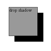
Drop Shadow

filter:progid:DXImageTransform.Microsoft.DropShadow(color='#000000',offX='20',offY='20');
Drop Shadow is not really what you’d hope it was. This filter draws a copy of the original block and shifts and colors it based on the designated parameters. Unfortunately while the “drop” part works as expected there isn’t much control over the “shadow” and you’re left with quite a hard copy of the original. While it may be useful in limited cases its not a wholesale replacement for box-shadow.
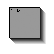
Shadow

filter:progid:DXImageTransform.Microsoft.Shadow(color='#000000',direction='120',strength='20');
Shadow creates a gradient that isn’t so much of a shadow against another plane as it is an extrusion or motion trail behind the target element. Possibly interesting amidst an animation, but there isn’t a standard CSS equivalent so again it has limited uses.
Blur

filter:progid:DXImageTransform.Microsoft.Blur(PixelRadius='15', MakeShadow='true', ShadowOpacity='0.40');
Blur is one of those filters that makes you wonder why they exist. It does exactly what it says and directly blurs the content of the block it is applied to making the content unreadable. I imagine it was implemented with the idea that it could be a scripted part of a transition [e.g. blurring an image in a slideshow] but as a static style its something to avoid. Or maybe it could be exploited…
The Cross Browser Solution
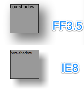
From experimentation I saw that while Blur is applied to the target content directly and would never work as is its parameters and appearance most closely resembled the control we have with CSS box-shadow. So how do we make “blur” apply to a “shadow”? We blur a duplicate of the target layer, position it behind the target and then “drop” the position of it as desired. Pay attention to the offset of the blurred layer as IE will include the edge of the blur as the top and left of the block.
<style type="text/css">
.example5wrap {
position: relative;
height: 100px;
}
.example5 {
position: absolute;
top: 0;
left: 0;
z-index: 2;
-moz-box-shadow: rgba(0,0,0,0.50) 20px 20px 50px 5px;
-webkit-box-shadow: rgba(0,0,0,0.50) 20px 20px 50px;
box-shadow: rgba(0,0,0,0.50) 20px 20px 50px 5px;
}
.ie-shadow {
display: none; /* don't show in non-ie browsers */
}
</style>
<!--[if IE]>
<style type="text/css">
.ie-shadow {
display: block;
position: absolute;
top: 5px;
left: 5px;
width: 102px; /* match target width */
height: 102px; /* match target height */
z-index: 1;
background: #000;
filter:progid:DXImageTransform.Microsoft.Blur(PixelRadius='15', MakeShadow='true', ShadowOpacity='0.40');
}
</style>
<![endif]-->

I’m sure there’s some way to calculate the Blur parameters to match the appearance of css3 property, but in this case I just eyeballed the IE numbers. Additionally,the extra div that that the blur filter is applied to can easily be scripted to be added in IE only and added to the DOM and styled to match the target object. Doing this in jQuery would look something like the following:
if ($.browser.msie) {
var $elm = $(".target");
var pos = $(elm).position();
$elm.after("<div class='ie-shadow'></div>");
$(".ie-shadow").width($(elm).width()).height($(elm).height()).css("left", (pos.left + 5) + "px").css("top",(pos.top + 5) + "px");
}
Conclusion
I’m not the first person to come up with this method of creating a box-shadow. Some searching the internets revealed a few similar setups and even an older javascript library to automate things, but I was unhappy with the explanation of the problem or basis for the code I found. There are certainly some limitations to this method. First browsers as recent as Firefox 3.0 will not see either solution so you should. Second, as you’ve can see positioning and z-index is used to overlap content and that may limit your layout options. Ultimately its another good tool to have in your arsenal along with standard ‘flat’ background images as well as more complex PNG based solutions. In the end that’s what we do as web developers — collect these little tools and tricks and whip them out when they best fit the project.
This is one article of 52 I’ll be writing in year 2010 on web design, technology, photography and probably some other topics. Please let me know what you think of the project and the topics covered.
Comments Temporarily(?) Removed