Mystery meat navigation is a term web designers know well. It represents the result of a designer getting too clever for their own good and burying site navigational elements under the surface — expecting users to spend the effort to discover them. With important links behind objects that have to be interacted with a site’s visitor loses context and that information a first glance of the page can provide and may leave or give up before finding what they were looking for even if its there.
Mystery Meat Pagination
As a whole, the industry has learned from the past and I don’t encounter many examples of cases of mystery meat navigation in the wild. But with new technology comes new opportunities to run aground. In the last year or two I’ve seen many new sites implementing an infinite scrolling or lazy loading technique with AJAX.
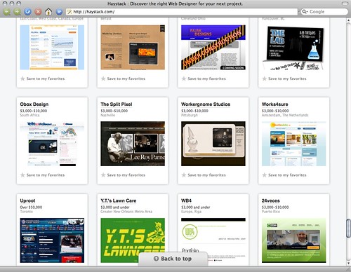
These “remove the need for pagination clicking” techniques really tend to irk me. I haven’t seen one yet that doesn’t hit me as either clunky and heavy handed or that immediately cause me to lose the context of where I’m searching. Spending some time poking around 37signals recently launched web studio directory Haystack prompted this post, and is a good example, but they shouldn’t be picked on as the only or worst offender.
In 2006, 37signals themselves had a short post on infinite scrolling where they mentioned the “turns your scrollbar into a liar” problem. But there’s more to context hinting then just the scrollbar. This solution to the problem of users not clicking past the first page of an index of items seems to regularly get me lost at worst or uninterested at best by what would have been page 2 or 3.
Making it better?
So how do we design infinite scrolling better so we lose the mystery meat pagination aspects? I think there are a number of easy context clues that designers can employ without adding much to the level of complexity of the design or implementation. For starters — be up front about the size of the data set. If I know there will be 45 items I may be inclined to work my way to the end, but if its 1045 I know I need to make a decision at some point that i’ve seen enough and it is safe to bail out [without the sinking feeling that I’m only missing 1 or 2 more items].
Another context clue is relevancy. Particularly when search result sets are involved traditional pagination can been a bad indication of relevancy. If a search on Google yields 10 million results chances are there will be solid information on page 3 or 4 or 5 and not just 1. But at a certain point things get less relevant or timely and can possibly be dropped all together from the data presented to the user, or some indication of how relevant, popular or recent can be presented with each item so a judgement can be made about when to abandon browsing.
There are other issues like performance, history & back and forward navigation [again one of context], accessibility issues due to lack of alternative functionality or notifications of new days, SEO and site crawling roadblocks — all that may have technology based solutions but where current implementations typically do not.
Until then, can we please just drop it [see: Microsoft Bing vs. Live Search] or start looking for other ways to manage paging through large amounts of data? Maybe the answer isn’t a page that contains 573 items, but instead better filtering. Or better hinting at “more” or “next”. Or better clues that there are more high ranking results on the next page that entices me to see more.
I don’t have all the answers, just felt the need to get that off my chest.
Comments Temporarily(?) Removed